How to Overlay Two Histograms in Excel
تمت المراجعة العلمية · د. مروة عبد العظيم · 4 سبتمبر، 2026
معايير التدقيق والاعتماد السريري
يخضع هذا المحتوى لمعايير ضبط الجودة والتدقيق العلمي والأكاديمي الصارمة في شبكة علم النفس العربي، لضمان صحة المعلومات ودقتها السريرية ومطابقتها لأحدث الأدلة والبراهين الصادرة عن الجمعيات النفسية والطبية المعتمدة (APA / WHO).
In quantitative empirical research, business intelligence, and scientific data analysis, visualizing continuous probability distributions across comparative cohorts is a fundamental diagnostic task. While single-distribution analyses provide foundational insight into the central tendency, dispersion, and morphology of a continuous variable, real-world investigative inquiry almost invariably demands comparative methodologies. Researchers and analysts frequently seek to contrast experimental treatment cohorts against control groups, evaluate cross-sectional demographic divisions, benchmark multi-plant manufacturing tolerances, or track longitudinal operational shifts. Superimposing two continuous frequency distributions into a unified visual space—commonly known as an overlaid histogram—serves as an indispensable graphical technique for identifying subtle structural divergences, distributional shifts, and overlapping densities that summary statistics often obscure.
Despite the widespread utility of dual-distribution overlays, Microsoft Excel presents unique architectural hurdles for practitioners attempting to construct these visualizations natively. The native Histogram chart engine introduced in modern Excel releases was engineered primarily for isolated, single-series exploratory data analysis. Consequently, it lacks native support for multi-series categorical grouping, multi-layer series stacking with dynamic transparency, and coordinated secondary axis alignment. When multiple series are directed into Excel’s default histogram engine, the application either collapses the data into an undifferentiated aggregate distribution or refuses to render the secondary series entirely. Overcoming this software constraint requires analysts to abandon the automated single-series chart tool in favor of robust, mathematically rigorous manual binning pipelines, PivotTable aggregation architectures, or dynamic array formulas coupled with customized Clustered Column and Combo chart configurations.
This comprehensive technical treatise examines the mathematical, architectural, and graphical principles required to construct, format, and interpret publication-grade overlaid histograms within Microsoft Excel. Across twelve detailed operational modules, this guide covers foundational binning mathematics—including Scott’s normal reference rule and the Freedman-Diaconis paradigm—tidy dataset structuring, PivotTable frequency grouping, formulaic matrix generation using modern dynamic array functions, series overlap mechanics, alpha-channel transparency calibration, and theoretical normal distribution curve integration. By mastering these empirical workflows, analysts can transform raw, unorganized observation streams into precise, visually compelling comparative graphics that withstand rigorous peer review and academic scrutiny.
1. Theoretical Foundations of Comparative Distribution Analysis in Excel
1.1 The Role of Histograms in Comparative Statistical Evaluation
The histogram stands as one of the most vital non-parametric tools in exploratory data analysis. Fundamentally, a histogram approximates the underlying probability density function of a continuous random variable by partitioning the entire range of observed values into a series of contiguous, non-overlapping intervals termed bins or class intervals. When evaluating independent sub-populations—such as clinical trial cohorts, distinct demographic tranches, or financial return series under differing macroeconomic regimes—relying strictly on classic summary statistics can lead to deeply flawed conclusions. Point estimates such as the arithmetic mean, median, variance, and standard deviation summarize data into single scalar values, inevitably discarding critical spatial information regarding the distribution’s structural morphology.
Visualizing comparative distributions simultaneously allows researchers to evaluate central tendency, dispersion, skewness, and kurtosis within a single unified perceptual framework. A comparative overlay instantly reveals whether two populations share identical central tendencies while exhibiting markedly different variances, or whether an apparent equality of medians masks severe directional skewness in one sub-cohort. More critically, superimposed distributions overcome the fundamental blind spots of parametric summary metrics when confronting multi-modal distributions. For instance, an experimental group exhibiting a bimodal distribution with peaks at polarized extremes might yield an identical arithmetic mean and standard deviation to a control group exhibiting a perfectly uniform or unimodal Gaussian distribution. In such scenarios, summary tables obscure the underlying physical reality, whereas an overlaid histogram immediately exposes the operational or biological divergence between the groups.
Furthermore, evaluating distribution overlap visually enables researchers to gauge the practical significance of differences beyond arbitrary p-value thresholds. The extent to which two histograms overlap spatially corresponds directly to probabilistic metrics of distributional divergence, such as the Overlapping Coefficient (OVL) and empirical effect sizes like Cohen’s d. Visualizing these distributional intersections provides vital intuitive context for understanding classification thresholds, false-positive risks in diagnostic testing, and the magnitude of separation between baseline and intervention metrics.
1.2 Challenges with Native Excel Histogram Tools for Dual Datasets
Beginning with Excel 2016, Microsoft introduced a dedicated “Histogram” chart option within the statistical charts library, intended to streamline exploratory data visualization by automating the binning process. While this native feature is convenient for rapid single-variable diagnostics, it possesses severe architectural limitations that render it unusable for sophisticated comparative analysis. The native histogram engine operates as a closed visual abstraction: it reads a single continuous array of numerical values, computes internal binning thresholds through an automated algorithm, and generates an uncoupled graphical representation. However, this engine lacks the capability to handle multi-series inputs, categorical multi-group segmentations, or paired continuous data streams.

When an analyst attempts to select two distinct data columns representing different groups and insert a native Excel histogram, the software routinely fails to render a dual-series comparative graphic. Instead, the engine typically combines the distinct data streams into an undifferentiated, single aggregate frequency distribution, entirely erasing the categorical boundaries between the groups. Alternatively, the software disables the multi-series formatting panels, preventing the user from assigning individual series fills, border outlines, or relative positions. The native chart tool does not expose the underlying bin boundary array to the spreadsheet grid, creating an impenetrable barrier against advanced customization, dual-axis alignment, or mathematical normalization.
Consequently, professional practitioners must bypass Excel’s automated statistical chart types entirely when constructing comparative visualizations. The robust workaround entails a two-phase decoupled architecture: first, the raw data must be explicitly discretized into deterministic frequency tables within the spreadsheet grid—utilizing either PivotTable grouping engines or dynamic array formulas—and second, the resulting frequency distributions must be rendered utilizing standard Clustered Column, Combo, or Area charting engines. By decoupling the mathematical binning phase from the visual rendering phase, the analyst regains absolute control over bin widths, alignment, series overlap, gap width, transparency, and statistical scaling.
1.3 Standardization and Binning Principles
The mathematical validity of an overlaid histogram depends entirely on the rigorous standardization of binning parameters across all comparison groups. A histogram’s visual profile is exceptionally sensitive to bin width and bin origin. If two datasets are categorized using disparate bin widths, mismatched cutoffs, or misaligned boundary offsets, any direct visual comparison between the resulting shapes is statistically invalid. For an overlay to provide honest visual inference, every bin must possess an identical interval width across both series, and the lower and upper bounds of bin k for Series A must coincide precisely with the lower and upper bounds of bin k for Series B across the entirety of the shared measurement domain.
Establishing optimal, uniform bin widths requires objective mathematical criteria rather than arbitrary visual guessing. Two prominent empirical formulations are widely utilized in standard statistical literature:
- Scott’s Normal Reference Rule: Formulated by David Scott in 1979, this rule optimizes the bin width h by minimizing the integrated mean squared error of the density estimate. The optimal bin width is calculated as:
h = (3.49 * s) / (n^(1/3))
where s represents the sample standard deviation and n represents the total number of observations. When applied to comparative datasets, s should represent the pooled standard deviation across both cohorts, and n should reflect the total aggregated sample size, ensuring a single, standardized bin width that balances resolution and noise across both distributions.
- The Freedman-Diaconis Rule: Formulated by David Freedman and Persi Diaconis in 1981, this rule provides a robust alternative that resists the distortion of extreme outliers or heavy-tailed distributions. It replaces the sample standard deviation with the Interquartile Range (IQR):
h = (2 * IQR) / (n^(1/3))
where IQR = Q3 – Q1. This approach prevents outlier values from artificially inflating the bin width, thereby preserving structural detail in the dense central core of the distributions.
Once the standardized bin width h is computed, the global range must be established by identifying the global minimum and global maximum across all aggregated observations. The lower boundary of the initial bin must be set slightly below or exactly at the global minimum, and the bin array must step monotonically by increments of h until the global maximum is fully encompassed. Synchronizing these boundaries ensures that the horizontal categorical axis represents identical physical intervals for both cohorts, establishing the mathematical prerequisite for meaningful visual overlay.
2. Dataset Architecture and Pre-Processing Strategies
2.1 Structuring Tidy Data for Comparative Visualization
Prior to executing any aggregation or charting procedures in Excel, the underlying dataset must be organized in accordance with the principles of tidy data architecture. In statistical computing, tabular layouts are broadly categorized into wide-format and long-format structures. The choice between these two architectural paradigms dictates the analytical tools available to the analyst within Excel’s ecosystem.
In a wide-format structure, each comparison group occupies its own independent column, with continuous observations listed vertically beneath the group header. For example, Column A might contain the quantitative measurements for “Control_Group”, while Column B contains the measurements for “Treatment_Group”. This structure is conceptually intuitive for manual inspection and is ideally suited for direct formulaic binning utilizing legacy array functions or modern dynamic array functions such as FREQUENCY and COUNTIFS. However, wide formats can become unwieldy when scaling to multiple cohorts or when sample sizes between groups are severely asymmetrical, resulting in ragged, uneven tabular columns containing trailing empty cells.
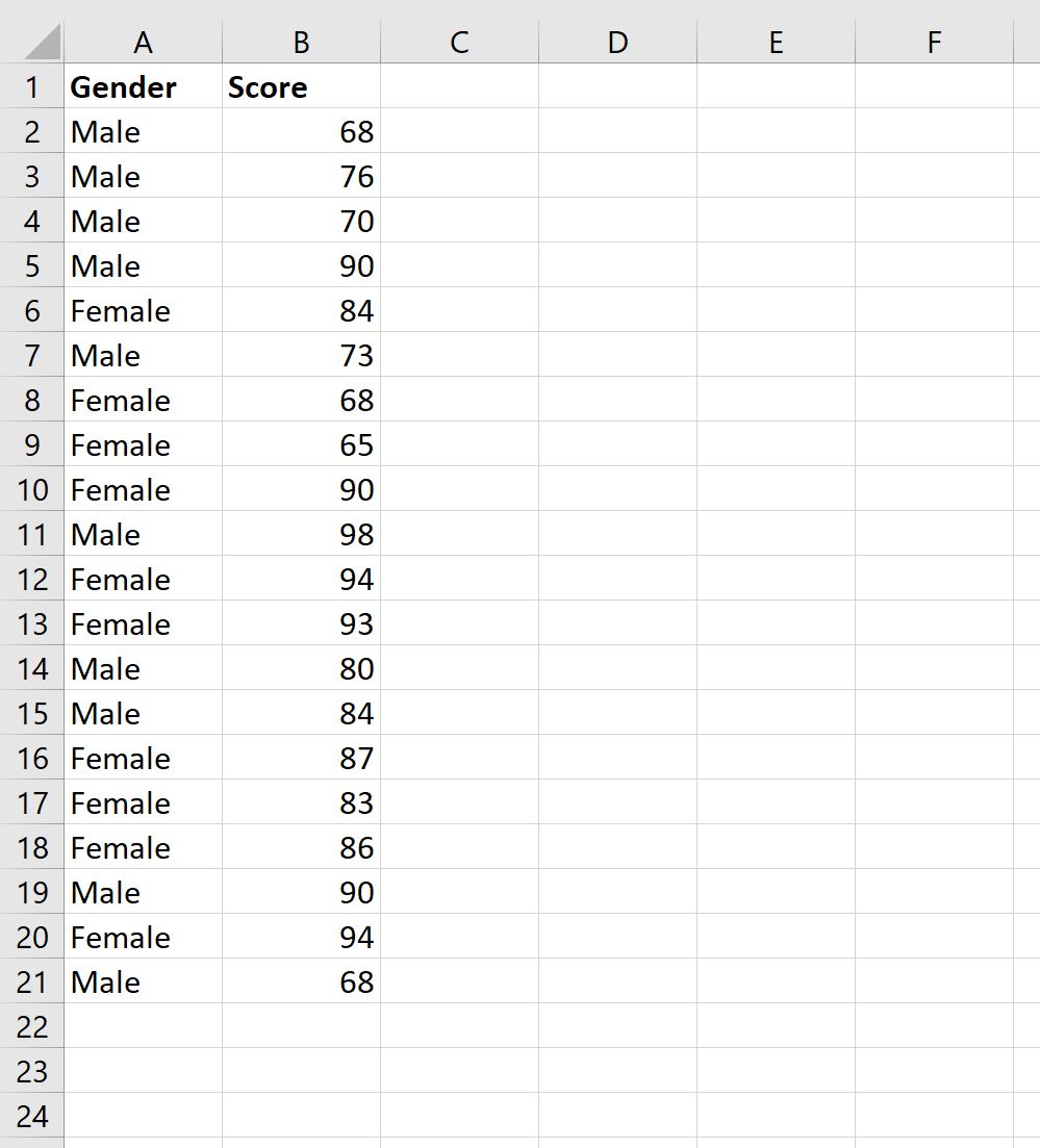
In a long-format (or normalized) structure, every individual observation occupies a single row, accompanied by explicit categorical attribute columns. A standard long-format design requires at minimum two columns: a continuous measurement variable (e.g., “Metric_Value”) and a nominal grouping variable (e.g., “Cohort_ID”). Long-format architecture is the industry standard for relational database management and represents the mandatory input structure for Excel’s PivotTable and PivotChart aggregation engines. Structuring data in this manner ensures absolute scalability, allowing analysts to seamlessly introduce additional experimental dimensions (such as gender, time point, or testing site) without restructuring the physical spreadsheet grid.
Data hygiene is paramount during the pre-processing phase. Raw measurement arrays must be systematically audited for null values, text-formatted numbers, non-numeric strings, and entry anomalies. In Excel, non-numeric artifacts within continuous data fields can corrupt mathematical array formulas, yielding errors such as #VALUE! or distorting PivotTable count calculations. Outliers must be evaluated to determine whether they represent genuine heavy-tailed phenomena or measurement errors; erroneous data points must be excised or corrected before calculating global range limits, ensuring that the visual distribution remains focused on valid empirical phenomena.
2.2 Defining Global Range Parameters
To guarantee that both frequency distributions share identical horizontal axis scales, the analyst must compute global range parameters that encompass the complete scope of all comparison groups simultaneously. Calculating local range boundaries for each dataset independently is a common procedural error; if Cohort A spans from 10 to 50 and Cohort B spans from 30 to 80, deriving bin boundaries independently will result in incompatible categorical axes that cannot be superimposed meaningfully.
The global minimum and global maximum must be calculated dynamically across the consolidated data array using Excel’s statistical aggregation functions. For wide-format datasets residing in ranges A2:A501 and B2:B501, the formulas are structured as:
Global Minimum: =MIN(A2:B501)Global Maximum: =MAX(A2:B501)Global Span: =MAX(A2:B501) - MIN(A2:B501)
For long-format datasets where values reside in B2:B1000 and group identifiers reside in A2:A1000, the aggregate minimum and maximum are extracted across the entire continuous column B2:B1000. Once the global boundaries and the target bin width h are established, the global start point should be rounded downward to the nearest convenient integer or rational step value below the global minimum. Similarly, the global end point must be rounded upward to ensure complete coverage of the global maximum.
To ensure computational scalability and workflow reproducibility, these structural boundaries and raw data arrays should be encapsulated within Excel’s Dynamic Named Ranges or official Excel Tables (instantiated via the keyboard shortcut Ctrl + T). Using structured table references—such as DataTable[Measurement]—allows all downstream binning calculations, PivotTable caches, and visual charts to automatically expand and recalculate whenever new experimental batches or observational records are appended to the dataset.
3. Method 1: Generating Frequency Distributions via PivotTables and Grouping
3.1 Initializing and Configuring the PivotTable Structure
The PivotTable grouping engine provides one of the most stable and computationally efficient methods for aggregating raw continuous data into discrete histogram bins without writing manual array logic. This method requires a long-format dataset containing a continuous numerical column and a categorical grouping column. Because PivotTables operate directly from an internal data cache, this workflow handles extensive datasets containing hundreds of thousands of rows effortlessly while maintaining dynamic interactive capabilities.
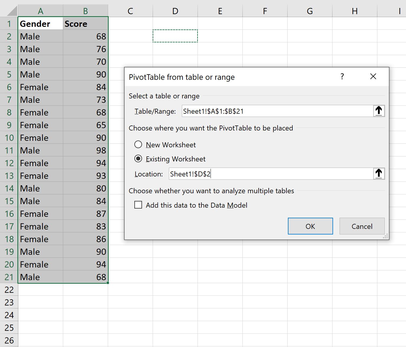
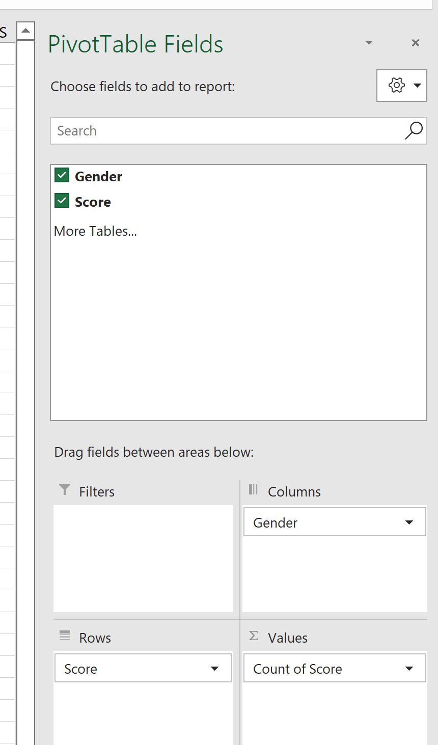
To initialize the aggregation structure, highlight the entire source data table and navigate to the Insert tab on the Excel ribbon, selecting PivotTable. In the dialog box, choose to place the PivotTable on a new dedicated worksheet to maintain analytical cleanliness. Once the blank PivotTable layout appears on the worksheet, configure the structural quadrants within the PivotTable Fields task pane as follows:
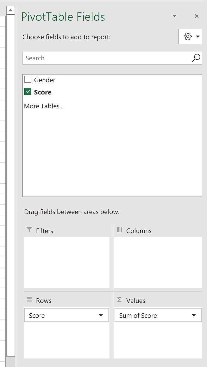
- Drag the continuous measurement variable (e.g., “Score” or “Measurement”) into the Rows quadrant. Initially, this action populates the vertical axis of the PivotTable with every unique discrete numeric value present in the raw data.
- Drag the categorical segmentation variable (e.g., “Treatment_Group” or “Cohort”) into the Columns quadrant. This generates separate side-by-side data columns for each unique cohort alongside a grand total column.
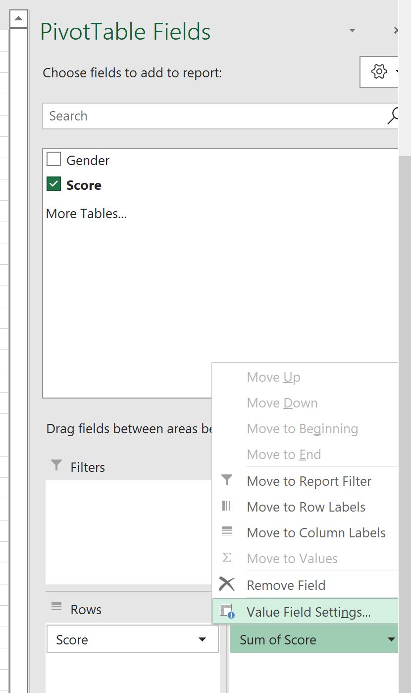
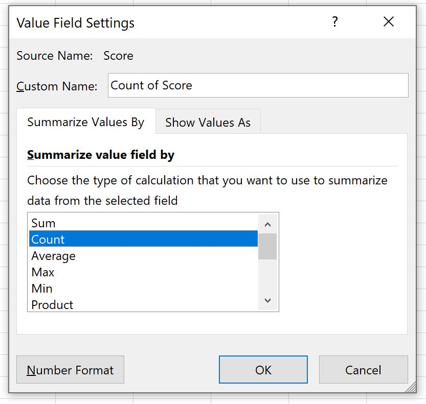
- Drag the continuous measurement variable a second time, placing it into the Values quadrant. By default, Excel may attempt to aggregate the field using the
Summathematical operation. Because the objective is to generate a frequency distribution, left-click the field in the Values box, select Value Field Settings, and switch the aggregation function fromSumto Count.
At this stage, the PivotTable displays raw discrete counts for every individual numeric value segmented across the respective columns. The continuous data has not yet been discretized into class intervals, which leads directly to the execution of the automated grouping pipeline.
3.2 Executing Automatic Binning via PivotTable Group Selection
Discretizing the continuous row items into uniform, standardized histogram bins is accomplished via the native grouping functionality built into Excel’s PivotTable architecture. This process eliminates the need to construct complex mathematical lookup formulas while ensuring absolute consistency across all segmented columns.
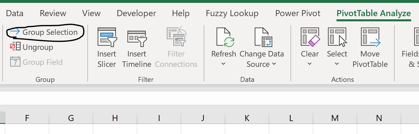
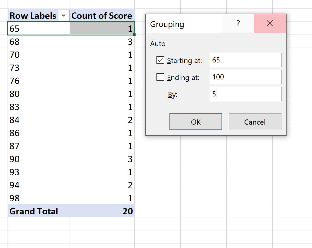
To execute the binning operation, right-click on any numeric cell within the Row Labels column of the PivotTable and select Group from the contextual menu (alternatively, navigate to the PivotTable Analyze tab on the Ribbon and click Group Selection within the Group command cluster). The Grouping dialog window will appear, presenting three explicit parameter input fields:
- Starting at: This defines the absolute lower threshold of the initial bin. By default, Excel automatically checks the box and populates this field with the sample minimum. Uncheck the automatic checkbox and enter the predetermined global lower limit calculated in Section 1.3 to ensure the boundary aligns with theoretical standards.
- Ending at: This defines the absolute upper threshold of the terminal bin. Uncheck the automatic checkbox and enter the predetermined global upper limit that securely encapsulates the maximum observed value across all cohorts.
- By: This represents the uniform class interval or bin width (h). Enter the mathematically derived step size (e.g., 5, 10, or 25) computed via Scott’s rule or the Freedman-Diaconis theorem.
Upon clicking OK, the PivotTable engine instantly collapses the granular individual rows into continuous, non-overlapping categorical intervals (e.g., 50-59, 60-69, 70-79). Crucially, because the grouping engine applies this interval transformation globally across the entire Row quadrant, both cohorts in the Columns quadrant are segmented across identical, synchronized bin intervals simultaneously, establishing the baseline frequency distribution.
3.3 Normalizing Frequency Output for Disparate Sample Sizes
A critical statistical flaw in comparative histogram analysis arises when comparing sub-populations with unequal sample sizes (i.e., where the number of observations in Cohort 1, N1, does not equal the number of observations in Cohort 2, N2). If Group A contains 10,000 observations and Group B contains 1,000 observations, plotting raw frequency counts on an overlaid chart will result in Group A visually dwarfing Group B across every bin. This visual disparity misleads the viewer into concluding that Group A possesses a higher density or different relative distribution, whereas the disparity is merely an artifact of raw sample volume.
To execute a mathematically valid comparative distribution analysis, raw frequency counts must be converted into relative frequencies or percentage distributions. Converting counts to proportions normalizes the total area under each distribution curve to 1.0 (or 100%), allowing the analyst to evaluate relative morphological features, shifts in modal peaks, and dispersion patterns independent of sample magnitude.
Excel’s PivotTable architecture allows this mathematical normalization to be executed instantaneously without creating manual calculation columns. To convert raw frequencies to relative percentages:
- Right-click any aggregated numeric cell within the Values section of the PivotTable.
- Navigate to Show Values As in the contextual pop-up menu.
- Select % of Column Total from the secondary option list.
The PivotTable will immediately recalculate all internal cell values, expressing the frequency of each bin as a percentage of that specific cohort’s aggregate total. The sum of the percentages for Group A down the column will equal exactly 100.0%, and the sum for Group B will likewise equal exactly 100.0%. This normalization establishes complete parity between the series, providing the foundational dataset required to build an overlaid Clustered Column PivotChart.
4. Constructing and Transforming the PivotChart into an Overlaid Histogram
4.1 Inserting the Base Clustered Column PivotChart
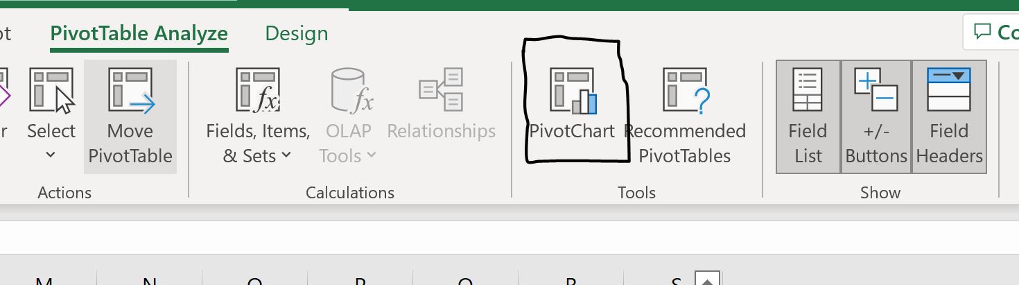
With the frequency data properly aggregated, binned, and normalized within the PivotTable, the visual construction phase begins by generating a base graphical structure. Ensure the active cell selection resides anywhere within the perimeter of the configured PivotTable. Navigate to the Insert tab on the Ribbon, locate the Charts group, and select PivotChart (or click PivotChart within the PivotTable Analyze tab).
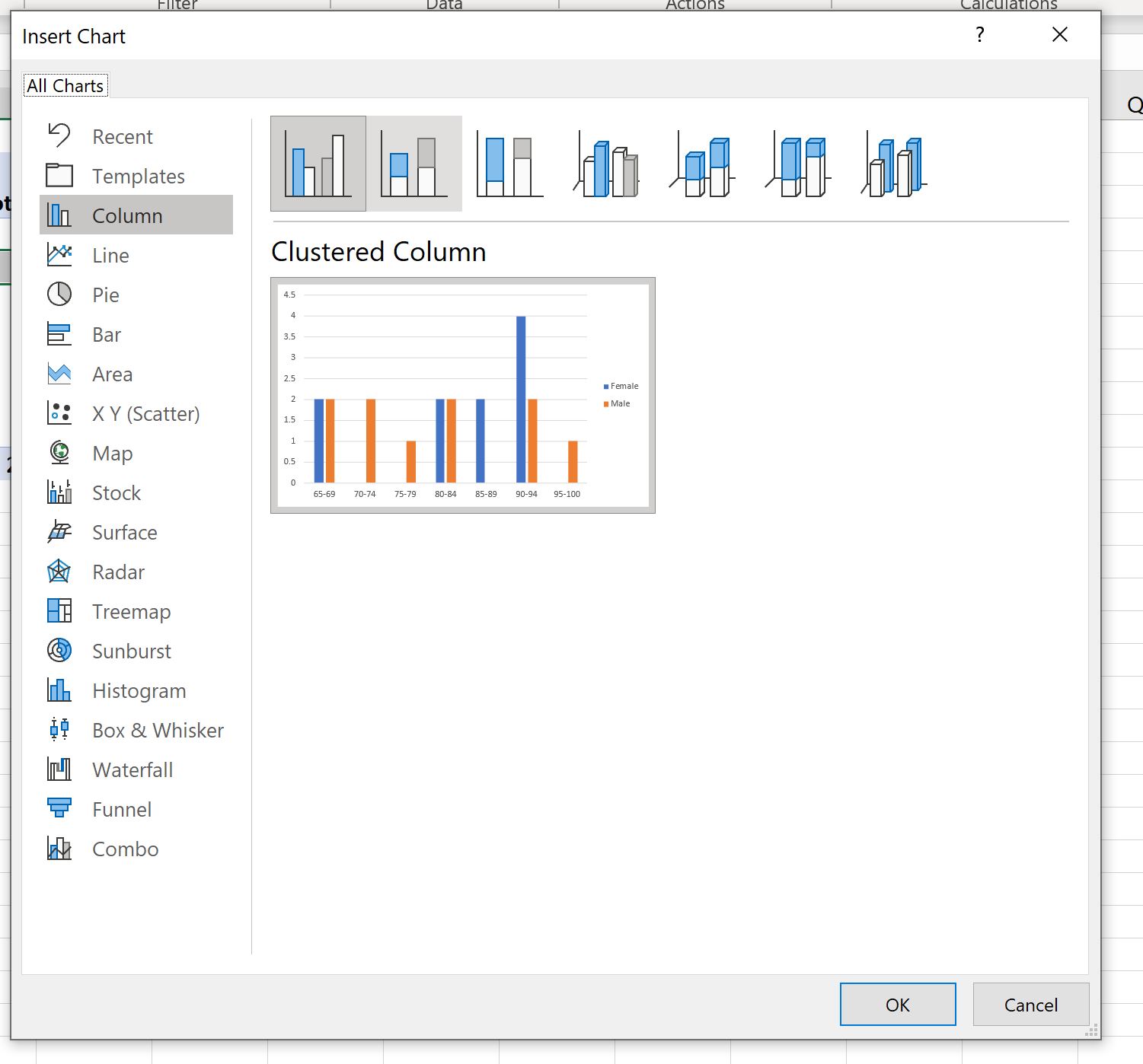
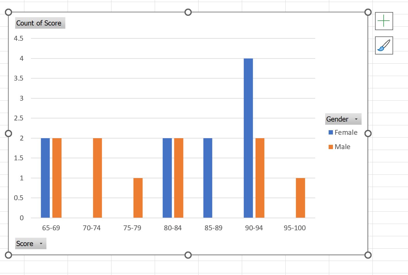
From the Insert Chart dialog, choose a standard 2-D Clustered Column chart. Excel will generate a chart canvas displaying the discrete bin intervals along the horizontal (category) axis, the normalized relative frequencies along the vertical (value) axis, and individual vertical columns for each cohort clustered side-by-side within each bin interval.
Prior to executing stylistic transformations, inspect the baseline chart elements for visual clarity and academic rigor:
- Verify Bin Sequencing: Ensure that the horizontal axis intervals follow a strictly ascending ordinal sequence from left to right without omissions or unexpected categorical reversals.
- De-clutter PivotChart Field Buttons: By default, Excel overlays interactive grey field buttons (e.g., “Sum of Score”, “Cohort”) directly on the chart canvas. These controls consume critical plotting area and degrade academic presentation standards. Right-click any visible field button on the chart and select Hide All Field Buttons on Chart to achieve an unencumbered, professional plotting surface.
- Remove the Grand Total Series: If the underlying PivotTable includes a Grand Total column that appears as a third clustered bar within the chart, navigate to the PivotTable’s Design tab, click Grand Totals, and select Off for Rows and Columns. This removes the composite series, leaving only the primary comparison cohorts.
4.2 Eliminating Gap Width to Simulate Continuous Histograms
By graphical convention, a bar chart represents discrete, categorical variables separated by blank interstitial spaces (gaps), whereas a true histogram represents continuous quantitative variables where adjacent bins share exact mathematical boundaries. Therefore, a histogram must feature zero empty space between consecutive bin intervals to communicate visual continuity. Standard clustered column charts default to an interstitial gap width of 219%, creating wide voids between bins that falsely imply discrete categorization.
To transform the clustered column chart into an authentic histogram aesthetic, the gap width parameter must be reduced to zero:
- Right-click any of the vertical data columns within the active chart canvas and select Format Data Series from the contextual menu. This opens the Format Data Series docking pane on the right side of the workspace.
- Within the Series Options tab (represented by the three-bar icon), locate the Gap Width slider control.
- Drag the slider completely to the left, or manually enter 0% into the numeric input box and press Enter.
Eliminating the gap width forces the column boundaries of adjacent bins to touch flush against one another, correctly visualizing the contiguous nature of the underlying continuous measurement scale. At this stage, the chart displays paired columns touching side-by-side across the bins. To convert this clustered configuration into a genuine superimposed overlay, specific series overlap and secondary axis adjustments must be implemented.
5. Method 2: Formula-Based Histogram Preparation Using Dynamic Array Functions
5.1 Constructing Explicit Bin Arrays in Standard Spreadsheets
While PivotTables provide automated binning, constructing frequency distributions directly within the standard spreadsheet grid utilizing dynamic formulas offers complete mathematical transparency, deterministic cell referencing, and immunity from PivotCache refresh delays. Modern versions of Microsoft Excel (Microsoft 365 and Excel 2021) incorporate native Dynamic Array calculation engines that allow complex multi-cell statistical models to be generated via concise, elegant formulas.
The first structural requirement of the formula-based pipeline is the generation of explicit upper-limit threshold vectors. Suppose our global analysis dictates a distribution starting at 0, terminating at 100, with a uniform bin width h of 10. Rather than manually typing sequential numbers down a column, analysts can leverage Excel’s dynamic SEQUENCE function to instantiate the bin array programmatically.
In an empty worksheet, establish the bin parameters in defined input cells: cell E2 (Start = 0), cell E3 (Step = 10), and cell E4 (Number of Bins = 10). In cell F2, enter the following dynamic formula:
=SEQUENCE(E4, 1, E2 + E3, E3)
This formula immediately spills an array of upper bin boundaries (10, 20, 30, … 100) downward across 10 contiguous rows. To generate clean, professional horizontal axis labels that clearly communicate bin boundaries to readers, construct a parallel label column in cell G2 utilizing string concatenation and dynamic referencing:
=LET(upper, F2#, step, E3, lower, upper - step, lower & " - " & upper)
The LET function assigns internal variable names to intermediate calculations, generating a clean categorical text array (e.g., “0 – 10”, “10 – 20”, “20 – 30”) that dynamically updates if the baseline step size or starting parameters are altered.
5.2 Computing Frequencies Using the FREQUENCY and COUNTIFS Formulas
Once the explicit bin threshold vector is established, the frequency counts for each comparison cohort must be derived across the intervals. In Excel, this can be achieved using either the high-performance native FREQUENCY array function or conditional COUNTIFS aggregation logic.
The FREQUENCY function is a specialized statistical engine that calculates how often values occur within specific ranges, returning a vertical array containing k + 1 elements (including an implicit upper overflow bin). Assuming the continuous data for Cohort A resides in range A2:A1000 and the upper bin boundaries reside in the spilled range F2#, enter the following formula in cell H2:
=FREQUENCY(A2:A1000, F2#)
In Microsoft 365, this formula automatically spills the exact frequency counts down the column adjacent to the bin thresholds. A parallel formula is entered in cell I2 referencing Cohort B (e.g., =FREQUENCY(B2:B1000, F2#)). Note that the FREQUENCY function utilizes inclusive upper boundaries (i.e., values greater than the prior threshold up to and including the current threshold: (lower, upper]).
Alternatively, analysts seeking explicit control over boundary inequality operators can utilize the COUNTIFS function. While slightly more computationally intensive than FREQUENCY on massive arrays, COUNTIFS allows custom boolean conditions (e.g., strictly greater than lower bound, less than or equal to upper bound):
=COUNTIFS($A$2:$A$1000, ">" & (F2-E$3),$A$2:$A$1000, "<=" & F2)
When evaluated across the entire bin array, both computational methods generate two parallel frequency vectors ready for downstream percentage normalization and charting.
5.3 Generating Percentage Distributions via Dynamic Calculations
To prevent the visual scale distortions detailed in Section 3.3, raw formula-driven frequency arrays must be converted to relative percentages. Using dynamic array notation, this normalization calculation is exceptionally streamlined. In cell J2, compute the percentage distribution for Cohort A by dividing the spilled frequency array by the total count of valid observations:
=H2# / COUNT(A2:A1000)
Similarly, for Cohort B in cell K2:
=I2# / COUNT(B2:B1000)
Format columns J and K as percentages with one or two decimal places via the Number Format dialog (or Ctrl + Shift + %). The result is a clean, structured summary table residing directly in the spreadsheet grid, containing explicit text labels in Column G and normalized percentage frequencies in Columns J and K. Because this summary table is entirely formula-driven, any modifications, data additions, or parameter shifts in the raw source tables will propagate through these calculations and update the charts in real time.
6. Implementing Series Overlap and Secondary Axis Coordination
6.1 Adjusting Series Overlap for Direct Juxtaposition
When multiple series are rendered within a standard clustered column chart, Excel places the bars for each series side-by-side within their respective categorical bin slots. In this default configuration, Cohort A’s bar occupies the left half of the bin space, while Cohort B’s bar occupies the right half. This side-by-side clustering does not constitute a true overlaid histogram; rather, it creates an interrupted visual flow that hinders the reader’s ability to intuitively compare distribution shapes and density centroids.
To convert side-by-side clusters into a direct superimposed overlay, the Series Overlap parameter must be adjusted to its theoretical maximum:
- Select any data column within the chart to open the Format Data Series task pane.
- Under the Series Options tab, locate the Series Overlap slider control.
- By default, this value is set to 0% (or negative values in older Excel releases). Adjust the slider completely to the right, or enter 100% into the numeric input field.
Setting the Series Overlap to exactly 100% forces Excel to align the centerlines of both series columns directly over one another within each bin interval. However, executing this adjustment immediately introduces a severe graphical problem: visual occlusion. By default, Excel renders data series with 100% opaque solid fills. Consequently, whichever series is ordered second in the chart’s internal data hierarchy will be drawn directly on top of the first series, completely concealing the underlying columns of the foreground series. Resolving this visual occlusion requires calibrating alpha-channel transparency, edge borders, or coordinating secondary axis assignments.
6.2 Leveraging Primary and Secondary Axes for Distinct Metric Scales
In specific empirical scenarios—such as when absolute counts must be retained rather than normalized percentages, or when comparing two metrics possessing vastly different absolute scales—analysts may choose to assign the secondary cohort to Excel’s Secondary Vertical Axis. This technique gives each distribution its own independent vertical coordinate system while keeping them superimposed over the same shared horizontal categories.
To assign a data series to the secondary vertical axis:
- Left-click specifically on the column series corresponding to Cohort B within the chart canvas.
- Within the Format Data Series pane, under Series Options, locate the Plot Series On selection toggle.
- Switch the selection from Primary Axis to Secondary Axis.
When this adjustment is applied, Excel instantiates a new vertical numerical scale along the right perimeter of the chart plot area. The columns for Cohort B are now mathematically scaled against the right vertical axis, while Cohort A remains anchored to the left vertical axis. However, plotting two superimposed distributions on dual unaligned vertical axes introduces severe risks of deceptive statistical communication. If the primary axis defaults to a maximum of 25% while the secondary axis auto-scales to a maximum of 50%, visual heights will no longer correlate to empirical probabilities, presenting a distorted picture of the underlying data.
6.3 Synchronizing Major Units Across Dual Vertical Scales
If a secondary vertical axis is utilized, strict mathematical parity must be enforced between the primary and secondary vertical scales to prevent visual distortion. The minimum bound, maximum bound, and major unit increments must be manually synchronized to match identically across both axes.
To enforce strict 1:1 parity between dual vertical axes:
- Identify the global maximum value across both normalized percentage arrays (for example, if the peak bin in Cohort A is 28% and in Cohort B is 34%, the target global ceiling is 35% or 40%).
- Right-click the Primary (Left) Vertical Axis and select Format Axis.
- Under Axis Options, locate the Bounds section. Change the Minimum from “Auto” to a fixed value of
0.0and the Maximum from “Auto” to a fixed ceiling, such as0.40(representing 40%). Set the Major Unit to a fixed interval, such as0.05(5%). - Next, select the Secondary (Right) Vertical Axis and repeat the identical parameter configuration: set Minimum to
0.0, Maximum to0.40, and Major Unit to0.05.
Once parity is enforced, the relative heights of the columns on both axes correspond to an identical physical scale. To maximize visual cleanliness and prevent cluttering academic figures, the secondary vertical axis line and numeric tick labels can be hidden entirely (by setting its label position to None and line color to No line). This technique preserves the internal secondary axis layer separation while maintaining a clean, single-axis visual aesthetic for the reader.
7. Graphic Optimization: Transparency, Color Palettes, and Edge Definition
7.1 Applying Color Transparency to Overcome Visual Occlusion
The standard method for resolving column occlusion in 100% overlapped histograms is applying alpha-channel color transparency. Introducing transparency to the foreground series allows the viewer to see the background series clearly, creating a distinct visual blend in the overlapping regions that makes relative bin densities immediately apparent.
To configure color transparency across the data series:
- Select the first data series (Cohort A) by clicking its columns on the chart. In the Format Data Series task pane, navigate to the Fill & Line tab (the paint bucket icon).
- Ensure the fill type is set to Solid fill. Select a base hue (e.g., a deep corporate blue, hex code
#1F4E79). - Locate the Transparency slider control beneath the color picker. Adjust the transparency to approximately 30% to 40%.
- Next, select the second data series (Cohort B). Set its fill to Solid fill and choose a high-contrast, harmonizing complementary hue (e.g., an energetic amber or crimson, hex code
#C00000). - Set the transparency for Cohort B to between 40% and 50%.
When these two semi-transparent columns superimpose within a shared bin space, the optical mixing of the blue and red fills produces a distinct intermediate purple blend tone. This tri-tone visual structure instantly communicates three critical spatial domains: regions dominated exclusively by Cohort A, regions dominated exclusively by Cohort B, and regions where both distributions intersect.
7.2 Enhancing Structural Definition with High-Contrast Borders
While semi-transparent color fills effectively resolve occlusion, transparency inherently softens graphical edges, which can blur the boundaries between adjacent histogram bins. To restore sharp visual structure and ensure precise readability, analysts should apply solid, opaque border outlines to each series.
To configure professional border structures:
- Select the data series in the chart and open the Fill & Line panel within the Format Data Series pane.
- Expand the Border subsection and select Solid line.
- Choose a border color that matches the core hue of the series but in a fully saturated, 100% opaque tone (e.g., dark navy for the blue series, deep burgundy for the red series).
- Set the Width of the border line to between 1.0 pt and 1.5 pt. A crisp, medium-weight line clearly demarcates column boundaries without overwhelming the fill color.
- To further distinguish the series—particularly for readers reviewing monochrome or grayscale prints—alter the Dash type of one series. Setting the foreground series border to a Square Dot or Dash pattern while maintaining a solid stroke on the background series guarantees full visual interpretability even in the absence of color.
7.3 Selecting Academic and Accessible Color Palettes
Color selection in statistical visualization should prioritize cognitive clarity and accessibility over aesthetic novelty. Default spreadsheet palettes often feature oversaturated, fluorescent tones that cause visual fatigue and can obscure overlapping regions. Furthermore, standard red-green pairings present significant barriers for individuals with color vision deficiencies (such as deuteranopia or protanopia), rendering comparative distributions visually indistinguishable.
Analysts should adopt evidence-based color palettes derived from cartographic and statistical visualization research, such as those established by Cynthia Brewer’s ColorBrewer project. Recommended color pairings for dual-distribution overlays include:
- Navy Blue and Warm Amber: A classic palette combining a deep blue (
#2B5C8F) with an accessible amber-orange (#D95F02). This combination provides exceptional luminance contrast, remains fully distinguishable under all forms of color blindness, and reproduces clearly in grayscale. - Teal and Purple: A sophisticated pairing featuring a rich teal (
#1B9E77) alongside a muted royal purple (#7570B3), offering clear separation across both light and dark visual presentation modes. - High-Contrast Slate and Crimson: An authoritative palette utilizing neutral slate grey (
#4D4D4D) for a baseline control group and a vivid crimson (#E41A1C) for an experimental intervention group, directing visual attention immediately toward experimental variance.
8. Method 3: Area and Line-Based Superimposed Frequency Polygons
8.1 Constructing Frequency Polygons Using Smoothed Line Charts
When comparing distributions across three or more cohorts, or when column histograms become visually cluttered due to high bin counts, a frequency polygon serves as an elegant alternative. A frequency polygon connects the midpoint coordinates of each histogram bin with continuous line segments, visualizing the distribution as a continuous geometric curve rather than discrete vertical columns.
To construct a frequency polygon using formula-derived distribution data:
- Calculate the exact geometric midpoint for each bin interval. For a bin spanning lower bound L and upper bound U, the midpoint is computed as:
Midpoint = (L + U) / 2
Generate a dedicated midpoint column within the spreadsheet grid to serve as the new horizontal coordinate reference.
- Select the midpoint vector alongside the normalized percentage arrays for all comparison cohorts, navigate to the Insert tab, and select a 2-D Line Chart (or Line with Markers).
- Format the series strokes with distinct solid colors, applying line weights between 2.0 pt and 2.5 pt for optimal visibility.
- Within the Format Data Series pane, expand the Line attributes and evaluate the Smoothed line checkbox. While applying Bezier curve smoothing produces an aesthetically pleasing, continuous curve, analysts must exercise caution: mathematical smoothing algorithms can introduce visual artifacts, such as dipping below the 0% baseline or artificially rounding sharp modal peaks. For rigorous scientific publications, standard un-smoothed linear segments connecting empirical midpoints remain the standard.
8.2 Creating Transparent Overlaid Area Charts
To enhance the visual impact of a frequency polygon, the chart can be converted into a semi-transparent Overlaid Area Chart. An area chart fills the entire region between the horizontal axis baseline and the continuous frequency curve, creating an intuitive representation of total probability mass.
To construct an overlaid area distribution graphic:
- Select the summary data table containing the bin midpoints and normalized percentage distributions.
- Navigate to the Insert tab, locate the Area Chart group, and select a standard 2-D Area Chart. (Warning: Do not select a “Stacked Area” chart, as stacking aggregates the series on top of each other, distorting the secondary cohort’s true baseline).
- Because Excel renders 2D area charts with opaque fills by default, the series in the foreground will initially obscure the series behind it. Open the Format Data Series pane for the foreground area series.
- Set the Fill to Solid fill, select an accessible palette hue, and set the Transparency slider to between 50% and 60%.
- Select the background area series, apply a harmonizing complementary hue, and configure its transparency to 50%.
The resulting visual displays two graceful, overlapping probability densities. Where both distributions intersect, the blended semi-transparent fill creates an intuitive visual representation of the shared population space, offering an accessible alternative to column-based overlays.
9. Integrating Theoretical Distributions: Overlaid Normal Curves
9.1 Generating Theoretical Normal Probability Curves
A frequent objective in comparative statistical analysis is contrasting empirical distribution data against theoretical parametric models—most commonly, the Gaussian or Normal Distribution. Superimposing theoretical normal curves directly over empirical histogram bars allows researchers to quickly evaluate normality assumptions, observe skewness, and assess empirical departures from standard parametric distributions.
To plot a theoretical normal curve over empirical data, the parametric properties (mean and standard deviation) must be calculated for each cohort, and the continuous Probability Density Function (PDF) must be computed across the measurement scale. The standard Gaussian PDF is mathematically defined as:
f(x) = (1 / (σ * √(2π))) * e^(-((x – μ)^2) / (2σ^2))

In Excel, this continuous probability density is computed via the native NORM.DIST function. Assuming the bin midpoint resides in cell M2, the sample mean μ resides in cell $B$10, and the sample standard deviation σ resides in cell $B$11, enter the following formula to calculate the point density:
=NORM.DIST(M2, $B$10, $B$11, FALSE)
Setting the fourth argument to FALSE instructs Excel to evaluate the exact probability density function rather than the cumulative distribution function (CDF). However, the raw output of this PDF cannot be plotted directly against normalized histogram percentages without scaling. The continuous PDF represents density per unit of x, whereas histogram percentage bins represent discrete probability mass across a bin width of interval size h. To scale the theoretical density to match the histogram column percentages, multiply the PDF output by the bin width h:
=NORM.DIST(M2, $B$10, $B$11, FALSE) * $E$3
This scaling factor aligns the theoretical curve with the discrete histogram bin percentages, ensuring that both distributions share a compatible vertical coordinate space.
9.2 Combining Clustered Histograms with Line Overlays (Combo Charts)
With empirical percentages and scaled theoretical normal distributions calculated across all bins, the data can be rendered into a unified Combo Chart that superimposes continuous parametric curves directly over the empirical histogram columns.
To construct the composite visualization:
- Highlight the complete data matrix: the Category Label column, the empirical percentage columns for Cohorts A and B, and the scaled theoretical normal curve columns for Cohorts A and B.
- Navigate to the Insert tab, locate the Charts group, click the Insert Combo Chart dropdown icon, and select Create Custom Combo Chart.
- In the configuration dialog, assign the chart types and axis bindings for each individual series:
- Cohort A Empirical: Set chart type to Clustered Column; leave Secondary Axis unchecked.
- Cohort B Empirical: Set chart type to Clustered Column; leave Secondary Axis unchecked.
- Cohort A Normal Curve: Set chart type to Line (or Smoothed Line); leave Secondary Axis unchecked.
- Cohort B Normal Curve: Set chart type to Line (or Smoothed Line); leave Secondary Axis unchecked.
- Click OK to generate the base combo chart on the worksheet.
- Format the empirical column series by setting Series Overlap to 100% and Gap Width to 0%, applying semi-transparent fills with solid borders as outlined in Section 7.
- Format the theoretical normal lines: select the Cohort A curve, set its line color to match Cohort A’s primary hue with 100% opacity, and configure its line weight to 2.0 pt. Apply the matching configuration to the Cohort B curve using Cohort B’s primary hue.
This combined visual architecture provides deep analytical insight. The semi-transparent columns communicate empirical sample realities (including sampling noise, discrete bin fluctuations, and outliers), while the overlaid continuous curves depict the idealized parametric models, highlighting any skewness or kurtosis in the underlying data.
10. Statistical Interpretation of Comparative Histogram Outputs
10.1 Evaluating Modality and Shape Differences
Once an overlaid histogram is constructed, the analytical focus transitions from technical graphical production to rigorous statistical interpretation. The primary diagnostic utility of a dual-distribution overlay lies in identifying structural differences that are obscured by basic summary metrics.
When analyzing overlaid distributions, analysts should systematically evaluate four key morphological characteristics:
- Modality and Latent Sub-Populations: Examine whether both cohorts exhibit single modal peaks (unimodal) or whether one cohort splits into multi-modal structures. A secondary peak within an experimental cohort often indicates a latent sub-population that responds differently to an intervention, revealing biological or operational nuances that a simple comparison of means would conceal.
- Differential Skewness (Asymmetry): Evaluate the direction and magnitude of distributional tails. If Cohort A is symmetric while Cohort B displays pronounced positive (right-tailed) skewness, the arithmetic mean for Cohort B will be pulled higher by extreme values, even if the majority of observations remain clustered below Cohort A’s median.
- Kurtosis and Tail Dispersion: Inspect the peakedness and tail thickness of the superimposed distributions. A leptokurtic distribution (sharp central peak, heavy tails) reflects concentrated performance accompanied by higher risk of extreme outliers, whereas a platykurtic distribution (broad, flat peak) reflects wider dispersion throughout the central core.
- Floor and Ceiling Effects: Identify unnatural truncations at the boundaries of the measurement scale. Severe column clustering at the minimum or maximum bin indicates measurement boundary limitations (such as test score ceilings or instrument detection thresholds), signaling that the measurement scale cannot fully capture the true underlying distribution.
10.2 Quantifying Distribution Overlap Indices
While an overlaid histogram provides immediate qualitative insight, empirical academic reporting requires pairing visual graphics with formal quantitative overlap metrics. The spatial intersection visible on the chart directly reflects statistical distribution overlap.
A primary quantitative metric is the Overlapping Coefficient (OVL), which measures the shared area beneath two empirical probability density functions:
OVL = ∫ min(f1(x), f2(x)) dx
In discrete spreadsheet calculations, the empirical Overlapping Coefficient is calculated simply by summing the minimum values of the normalized relative frequencies across all bins:
=SUM(MAP(J2:J11, K2:K11, LAMBDA(a, b, MIN(a, b))))
The resulting OVL index ranges from 0.0 (completely distinct distributions with zero intersection) to 1.0 (identically distributed cohorts). In scientific literature, this visual overlap should be reported alongside standardized effect size calculations, such as Cohen’s d:
d = (x̄1 – x̄2) / s_pooled
When presenting these comparative analyses in formal academic manuscripts conforming to American Psychological Association (APA 7th Edition) standards, the visual figure should be accompanied by clear narrative reporting. Include the total sample sizes (N1, N2), standardized bin interval widths (h), means, standard deviations, and the quantitative overlap metric within the figure caption, ensuring full empirical transparency.
11. Methodological Pitfalls and Troubleshooting in Excel
11.1 Diagnosing X-Axis Misalignment and Asymmetrical Bins
A common error encountered when building overlaid histograms in Excel is X-axis category misalignment. This problem occurs when Excel’s charting engine interprets the horizontal axis as an arbitrary collection of discrete text categories rather than an ordered, continuous numerical scale. If Cohort A contains observations in bins 1 through 10, but Cohort B contains zero observations in bins 1 and 2, a misconfigured formula or PivotTable might omit those empty bins from Cohort B’s data vector. Consequently, the charting engine will misalign the series, mapping Cohort B’s first non-zero bin onto Cohort A’s initial slot, creating a severely misleading visualization.
To diagnose and correct X-axis misalignment:
- Enforce Explicit Bin Templates: When using formula pipelines, ensure both series reference a shared, rigid categorical bin vector that includes all class intervals from the global minimum to the global maximum, regardless of whether a particular group has zero observations within a given bin.
- Show Empty Cells in PivotTables: If aggregating via PivotTables, ensure empty bins are explicitly displayed rather than dropped. Right-click the PivotTable, select PivotTable Options, navigate to the Layout & Format tab, check the box labeled For empty cells show, and input
0into the adjacent field. - Standardize PivotTable Field Settings: Right-click the binned Row field, select Field Settings, navigate to the Layout & Print tab, and enable Show items with no data. This forces the PivotTable and PivotChart to preserve zero-frequency bins along the horizontal axis, maintaining proper spatial alignment between the series.
11.2 Correcting Scale Distortion Caused by Automatic Formatting
Another common methodological issue is automatic axis recalibration distortion. Excel’s charting engine automatically recalculates axis scale boundaries whenever source data updates, slicers are clicked, or underlying values are refreshed. If primary and secondary vertical axes were manually synchronized at a 0% to 40% range, an update might cause the primary axis to auto-scale to 30% while the secondary axis shifts to 50%, instantly breaking the 1:1 scale parity established in Section 6.3.
To lock axis parameters against unwanted automatic adjustments:
- Right-click the target axis and select Format Axis.
- Under the Axis Options tab, inspect the numerical inputs for Minimum, Maximum, Major Unit, and Minor Unit.
- When an axis parameter is set to automatic, a “Reset” button appears adjacent to the input field. Manually re-enter the desired numerical values (e.g.,
0.0and0.40). Manually typing the value locks the setting into a Fixed state, removing the “Reset” button and preventing Excel from altering the scale during data refreshes. - Repeat this fixed parameter assignment across all primary and secondary vertical scales within the workbook to ensure lasting graphical integrity.
11.3 Managing Extreme Outliers and Skewed Tails
Extreme, low-probability outliers present significant visual challenges when designing overlaid histograms. If an otherwise compact distribution spanning 10 to 50 contains a single outlier at 500, setting a uniform bin width across the entire 0 to 500 range will compress the primary distribution into one or two narrow columns on the far left, while the remainder of the chart plot area becomes empty space.
To handle severe outliers without compromising distributional integrity:
- Implement Open-Ended Boundary Bins: Follow standard academic convention by establishing open-ended terminal bins (e.g.,
< 10for lower outliers and≥ 60for upper outliers). When configuring explicit formula bins viaCOUNTIFS, structure the final bin formula to aggregate all values exceeding the upper threshold:=COUNTIFS($A$2:$A$1000, ">=60")This encapsulates extreme values within a designated terminal column without expanding the chart’s horizontal scale unnecessarily.
- Provide Narrative Footnotes: When open-ended bins are utilized, document the truncation clearly within the figure caption or notes (e.g., “The terminal bin (≥60) includes 3 outlier observations from Cohort B at values 112, 145, and 189”). This maintains transparency while preserving visual resolution across the primary distribution.
12. Advanced Automation and Dynamic Dashboard Integration
12.1 Building Interactive Dynamic Overlaid Histograms with Slicers
For executive reporting environments and interactive analytical dashboards, static charts can be upgraded to dynamic visual tools utilizing Excel’s native PivotChart Slicers. Slicers allow users to filter, slice, and segment comparative distributions in real time without manually adjusting underlying data ranges or editing formulas.
To integrate interactive Slicer controls into an overlaid PivotChart architecture:
- Ensure your frequency aggregation is built upon the robust PivotTable framework detailed in Section 3, constructed from a normalized, long-format data table.
- Left-click anywhere within the active PivotChart canvas, navigate to the PivotChart Analyze tab on the Ribbon, and select Insert Slicer.
- In the Slicer selection dialog, select the secondary categorical dimensions you wish to explore interactively (e.g., “Demographic_Region”, “Fiscal_Year”, “Testing_Site”). Click OK.
- Position the generated floating Slicer controls adjacent to the chart canvas. Format the Slicers with clean, complementary styles matching your overall dashboard aesthetic.
- To enable seamless toggling between absolute count views and normalized percentage views, duplicate the underlying PivotTable: configure one table to display raw counts and the other to display
% of Column Total. By pairing these tables with dynamic chart series selection or simple form controls, users can switch the entire visualization between raw volume and normalized density views with a single click.
12.2 Automating Overlay Chart Generation with VBA / Office Scripts
For research teams and enterprise analysts who frequently generate comparative distribution graphics, manually configuring gap widths, series overlaps, transparent fills, and border weights for every new dataset can become repetitive and time-consuming. Automating these graphical adjustments via Visual Basic for Applications (VBA) or modern web-based Office Scripts ensures consistency across institutional workflows.
The following VBA procedure automates the entire formatting sequence on an active clustered column chart, applying standardized gap widths, 100% series overlap, curated high-contrast academic hues, calibrated alpha transparency, and sharp borders:
Sub FormatOverlaidHistogram()

    Dim targetChart As Chart

    Dim seriesA As Series

    Dim seriesB As Series
On Error Resume Next
Set targetChart = ActiveChart
If targetChart Is Nothing Then
MsgBox "Please select a Clustered Column Chart first.", vbExclamation, "No Chart Selected"
Exit Sub
End If
' Enforce contiguous histogram geometry
targetChart.ChartGroups(1).GapWidth = 0
targetChart.ChartGroups(1).Overlap = 100
' Format Series A (Baseline Cohort: Deep Navy Blue, 35% Transparency)
Set seriesA = targetChart.FullSeriesCollection(1)
With seriesA
.Format.Fill.Solid
.Format.Fill.ForeColor.RGB = RGB(31, 78, 121)
.Format.Fill.Transparency = 0.35
.Format.Line.Visible = msoTrue
.Format.Line.ForeColor.RGB = RGB(31, 78, 121)
.Format.Line.Weight = 1.25
.Format.Line.DashStyle = msoLineSolid
End With
' Format Series B (Comparison Cohort: Crimson Red, 45% Transparency)
If targetChart.FullSeriesCollection.Count >= 2 Then
Set seriesB = targetChart.FullSeriesCollection(2)
With seriesB
.Format.Fill.Solid
.Format.Fill.ForeColor.RGB = RGB(192, 0, 0)
.Format.Fill.Transparency = 0.45
.Format.Line.Visible = msoTrue
.Format.Line.ForeColor.RGB = RGB(192, 0, 0)
.Format.Line.Weight = 1.25
.Format.Line.DashStyle = msoLineDash
End With
End If
MsgBox "Overlaid Histogram formatting successfully applied.", vbInformation, "Formatting Complete"
End Sub
To export the finished visual for academic publication, avoid taking low-resolution screen captures. Instead, right-click the formatted chart border and select Save as Picture, choosing Scalable Vector Graphics (*.svg) or high-resolution Enhanced Metafile (*.emf). Vector exports scale smoothly to any resolution without pixelation, ensuring that your overlaid distributions render crisply across both print journals and digital presentations.
Conclusion
Superimposing two continuous frequency distributions into a unified, overlaid histogram is an essential technique for comparative empirical analysis. While Microsoft Excel does not provide a one-click native solution for dual-series histograms, analysts can easily overcome this software limitation by combining sound statistical binning principles with standard spreadsheet charting engines. By decoupling the mathematical aggregation phase (via PivotTables or dynamic array formulas) from the graphical presentation phase (via Clustered Column, Combo, or Area charts), researchers gain complete control over bin boundaries, series overlap, gap width, transparency, and statistical scaling.
Adhering to rigorous methodological standards—such as applying Scott’s or Freedman-Diaconis binning rules, normalizing raw frequencies to relative percentages, synchronizing dual vertical axes, selecting accessible color palettes, and reporting quantitative overlap metrics alongside visual figures—ensures that comparative histograms remain mathematically sound, visually clear, and publication-ready. Whether evaluating clinical cohorts, benchmarking industrial manufacturing tolerances, or analyzing economic distributions, mastering these overlay workflows in Excel enables analysts to transform raw quantitative data into compelling, evidence-based visual insights.
References
- American Psychological Association. (2020). Publication manual of the American Psychological Association (7th ed.). American Psychological Association. https://apastyle.apa.org/
- Brewer, C. A. (2006). Basic mapping principles for visualizing statistical data. Census 2000 Data Products Workshop. https://colorbrewer2.org/
- Cohen, J. (1988). Statistical power analysis for the behavioral sciences (2nd ed.). Lawrence Erlbaum Associates.
- Freedman, D., & Diaconis, P. (1981). On the histogram as a density estimator: L2 theory. Zeitschrift für Wahrscheinlichkeitstheorie und Verwandte Gebiete, 57(4), 453–476. https://doi.org/10.1007/BF01025868
- Inman, H. F., & Bradley, E. L. (1989). The overlapping coefficient as a measure of agreement between probability distributions and point estimation of the overlap of two normal densities. Communications in Statistics – Theory and Methods, 18(10), 3851–3874. https://doi.org/10.1080/03610928908830127
- Microsoft Corporation. (2023). Create a histogram in Excel. Microsoft Support. https://support.microsoft.com/
- Scott, D. W. (1979). On optimal and data-based histograms. Biometrika, 66(3), 605–610. https://doi.org/10.1093/biomet/66.3.605
- Tufte, E. R. (2001). The visual display of quantitative information (2nd ed.). Graphics Press.
- Wickham, H. (2014). Tidy data. Journal of Statistical Software, 59(10), 1–23. https://doi.org/10.18637/jss.v059.i10
- Wilkinson, L. (2005). The grammar of graphics (2nd ed.). Springer-Verlag. https://doi.org/10.1007/0-387-28695-0
