How to Overlay Two Histograms in Excel
تمت المراجعة العلمية · د. مروة عبد العظيم · 4 سبتمبر، 2026
معايير التدقيق والاعتماد السريري
يخضع هذا المحتوى لمعايير ضبط الجودة والتدقيق العلمي والأكاديمي الصارمة في شبكة علم النفس العربي، لضمان صحة المعلومات ودقتها السريرية ومطابقتها لأحدث الأدلة والبراهين الصادرة عن الجمعيات النفسية والطبية المعتمدة (APA / WHO).
In quantitative empirical research, the graphical representation of continuous data distributions serves as an indispensable prerequisite for exploratory data analysis, parametric validation, and inferential modeling. While individual histograms provide fundamental insights into the central tendency, dispersion, skewness, and modality of an isolated sample, contemporary data analysis frequently demands the direct visual juxtaposition of two or more empirical distributions. Whether comparing treatment cohorts in clinical trials, evaluating pre-test and post-test psychological metrics, or contrasting performance yields across distinct industrial processes, overlaying histograms within a single, unified coordinate space allows researchers to instantly diagnose structural differences that summary statistics such as the mean and standard deviation frequently obscure.
Despite the widespread utility of comparative distributional plots, researchers and quantitative analysts utilizing Microsoft Excel routinely encounter substantial architectural hurdles. Excel’s native statistical charting engine, introduced in modern versions of the software, was engineered primarily for single-series distribution analysis and lacks native support for multi-series overlaid histograms with synchronized, custom bin architectures. Consequently, analysts attempting to generate comparative histograms using out-of-the-box templates often produce misaligned categorical axes, incompatible class intervals, or visually opaque graphics that fail to convey true distributional overlaps.
This comprehensive technical treatise delineates the theoretical principles, mathematical algorithms, and step-by-step graphical procedures required to construct professional, publication-ready overlaid histograms within Microsoft Excel. By detailing multiple distinct methodologies—ranging from dynamic PivotTable grouping to the statistical FREQUENCY dynamic array function and customized secondary-axis column architectures—this guide equips researchers with the precise mechanisms needed to execute advanced distributional comparisons while maintaining strict mathematical fidelity and aesthetic rigor.
1. Introduction to Overlapping Histograms and Distributional Analysis
1.1 Conceptual Definition and Purpose of Comparative Histograms
A histogram is a non-parametric estimation of the probability distribution of a continuous quantitative variable. Originally introduced in modern statistical nomenclature by Karl Pearson, the histogram functions by discretizing continuous measurement data into a sequence of contiguous, non-overlapping intervals termed bins or class intervals. The vertical dimension of each bin conveys the absolute frequency count, relative frequency proportion, or continuous probability density of data points residing within that specific interval. Consequently, histograms bridge the gap between discrete observational samples and theoretical continuous probability density functions.
When analysts evaluate two distinct experimental cohorts or longitudinal conditions, displaying separate histograms across adjacent, isolated plots introduces significant cognitive friction. Isolated plots compel the viewer to perform mental translations across differing horizontal baselines, varying vertical scaling limits, and discordant bin boundaries. In contrast, an overlaid histogram unifies multiple empirical distributions upon a singular, identical abscissa and ordinate framework. This visual integration facilitates instantaneous geometric comparison of distributional properties, directly revealing relative shifts in location, scale, and shape.
It is vital to distinguish between absolute frequency count overlays and relative density estimations. Absolute frequency overlays plot raw counts directly, which provides accurate insight when sample sizes across both groups are strictly identical. However, when sample sizes diverge, raw frequency counts inherently distort visual interpretation, causing the larger cohort to visually dominate the smaller cohort regardless of their underlying probabilistic shapes. In such scenarios, converting raw frequencies into relative frequency proportions or density values becomes mathematically mandatory, ensuring that the total area under each plotted distribution normalizes to unity.
1.2 Analytical Advantages of Comparative Data Visualization
The visual analysis of overlaid distributions yields profound analytical advantages during exploratory data analysis (EDA). Foremost among these advantages is the immediate visual detection of higher-order distributional moments. While traditional parametric summary metrics convey the first moment (mean) and second moment (variance), they obscure the third moment (skewness, or distributional asymmetry) and fourth moment (kurtosis, or tail heaviness and peakedness). An overlaid distribution instantly clarifies whether an observed shift between two groups is driven by a uniform translation of the entire sample or by localized tail anomalies, outliers, or secondary subpopulation modes.
Furthermore, comparative histograms provide an intuitive visualization of the overlap zone between experimental conditions. The extent of intersection between two distributions provides direct visual evidence regarding the empirical magnitude of difference, contextualizing formal effect size metrics such as Cohen’s d. Analysts can readily ascertain whether two groups represent distinct, separated populations or heavily overlapping mixtures with negligible practical differences, despite potential statistical significance resulting from high sample sizes.
Within academic publishing, clinical reporting, and corporate technical documentation, comparative histograms elevate the transparency of statistical claims. By demonstrating the full distribution of empirical data rather than relying solely on reductive bar charts of means and standard error bars, researchers adhere to contemporary scientific data visualization guidelines, mitigating visual bias and preventing common interpretive fallacies such as concealing bimodal distributions within homogeneous aggregate metrics.
1.3 Structural Challenges in Microsoft Excel Native Histogramming
Microsoft Excel features a native statistical chart option titled “Histogram” under its primary charting menu. While this native tool provides an automated, rapid mechanism for plotting a single data series, its internal charting engine is fundamentally closed and rigid. When a user attempts to select multiple columns or categorical series and insert a native statistical histogram, Excel either fails to recognize the independent series or plots them sequentially rather than concurrently, preventing true visual co-location across identical bin ranges.
The primary structural limitation lies in Excel’s automated binning algorithm for native statistical charts. Because the native engine calculates bin thresholds dynamically per series based on internal heuristics, it does not allow the user to enforce a unified, external bin template across multiple distinct series simultaneously. If Group A and Group B possess different minimum values, maximum values, or variances, native histograms will assign divergent bin widths and start points to each series, rendering any direct visual overlay mathematically invalid.
To overcome these systemic constraints, researchers must construct overlaid histograms using Excel’s robust standard charting tools—specifically the 2D Clustered Column chart, Area chart, or Combo chart frameworks—driven by explicitly structured frequency distribution tables. By utilizing either PivotTables with uniform manual interval grouping, the dynamic array FREQUENCY formula, or normalized percentage tables, analysts regain complete deterministic control over bin boundaries, series overlap percentages, gap widths, color transparencies, and axis scaling.
2. Theoretical Foundations: Comparative Distributional Metrics
2.1 Bin Width Selection and Statistical Discretization Rules
The integrity of any histogram relies directly upon the mathematical selection of bin width. Selecting an inappropriate bin width results in severe analytical distortion: over-binning (choosing excessively narrow bins) introduces visual noise, spurious spikes, and empty intervals, while under-binning (choosing excessively wide bins) obscures critical distributional nuances, such as multimodality, local skewness, and subtle tail dynamics. When overlaying two distinct samples, establishing a shared, optimal bin width is essential to maintain identical spatial discretization across both cohorts.
Several established statistical heuristics provide mathematical guidelines for bin selection. Sturges’ Rule calculates the optimal number of bins (k) based on sample size (n) via the logarithmic formulation:
k = 1 + 3.322 * log10(n)
While Sturges’ Rule performs adequately for moderate samples characterized by ideal Gaussian normality, it drastically under-bins datasets with heavy tails or non-normal characteristics.

To address non-Gaussian data and variance disparities, David Scott developed Scott’s Normal Reference Rule, which optimizes bin width (h) by minimizing the integrated mean squared error of the density estimation:
h = (3.49 * s) / (n^(1/3))
where s represents the sample standard deviation and n represents total sample size. For comparative analysis involving skewed or outlier-prone empirical distributions, the Freedman-Diaconis Rule provides superior robustness by substituting variance with the interquartile range (IQR):
h = 2 * IQR(x) / (n^(1/3))
When calculating bin parameters for two comparative cohorts, analysts must compute the Freedman-Diaconis bin width for both groups independently and select the smaller resulting bin width, or apply the formula to the pooled dataset. This ensures that the bin resolution is sufficiently granular to capture the distributional details of both samples without introducing artificial discretization artifacts.
2.2 Distributional Overlap and Effect Size Visualization
Overlaid histograms provide a direct visual manifestation of standardized statistical effect sizes, most notably Cohen’s d and Hedges’ g. In theoretical statistics, when two normal distributions with equal variance share identical central tendencies (Cohen’s d = 0), their visual overlap is 100%, and the empirical histograms perfectly align. As the effect size increases to a medium effect (d = 0.5) or a large effect (d = 0.8), the spatial divergence between the histogram peaks expands, and the shared intersection area systematically contracts.
The degree of physical intersection between two empirical histograms directly corresponds to the Overlapping Coefficient (OVL), a non-parametric measure of similarity defined as the shared area under two probability density functions. Calculating and visualizing the OVL allows researchers to quantify the exact proportion of commonality between groups. For instance, in clinical psychology, an OVL of 0.60 indicates that 60% of the scores across the control and intervention distributions occupy identical measurement intervals, providing concrete, accessible context to accompany formal null-hypothesis significance testing.
Visualizing these overlapping distributions also safeguards researchers against misinterpreting parametric hypothesis tests. A standard independent samples t-test may indicate a statistically significant difference between two groups due to high statistical power, even when the underlying distributions are structurally complex. An overlaid histogram instantly exposes critical anomalies, such as bimodal sub-populations within a single experimental arm, severe floor or ceiling effects imposed by psychometric measurement constraints, or heterogeneous tail variances that violate homoscedasticity assumptions.
3. Data Preparation and Structuring for Excel Analysis
3.1 Raw Data Architecture: Long vs. Wide Formatting
Establishing an appropriate tabular architecture is the foundational prerequisite for any analytical workflow in Microsoft Excel. Empirical data typically exists in one of two structural configurations: wide format or long (tidy) format. Understanding the distinctions between these architectures determines which downstream charting methodology—PivotTables or dynamic array functions—is most efficient for producing overlaid histograms.
In wide format, observations for distinct experimental groups occupy separate, dedicated columns. For example, Column A may contain continuous test scores for Group 1 (e.g., Control), while Column B contains continuous scores for Group 2 (e.g., Treatment). Wide format is straightforward and highly compatible with dynamic array formulas such as FREQUENCY, as the formula can directly reference each columnar vector independently. However, wide format becomes unwieldy when sample sizes across cohorts are unequal, leaving uneven column lengths and blank trailing cells.
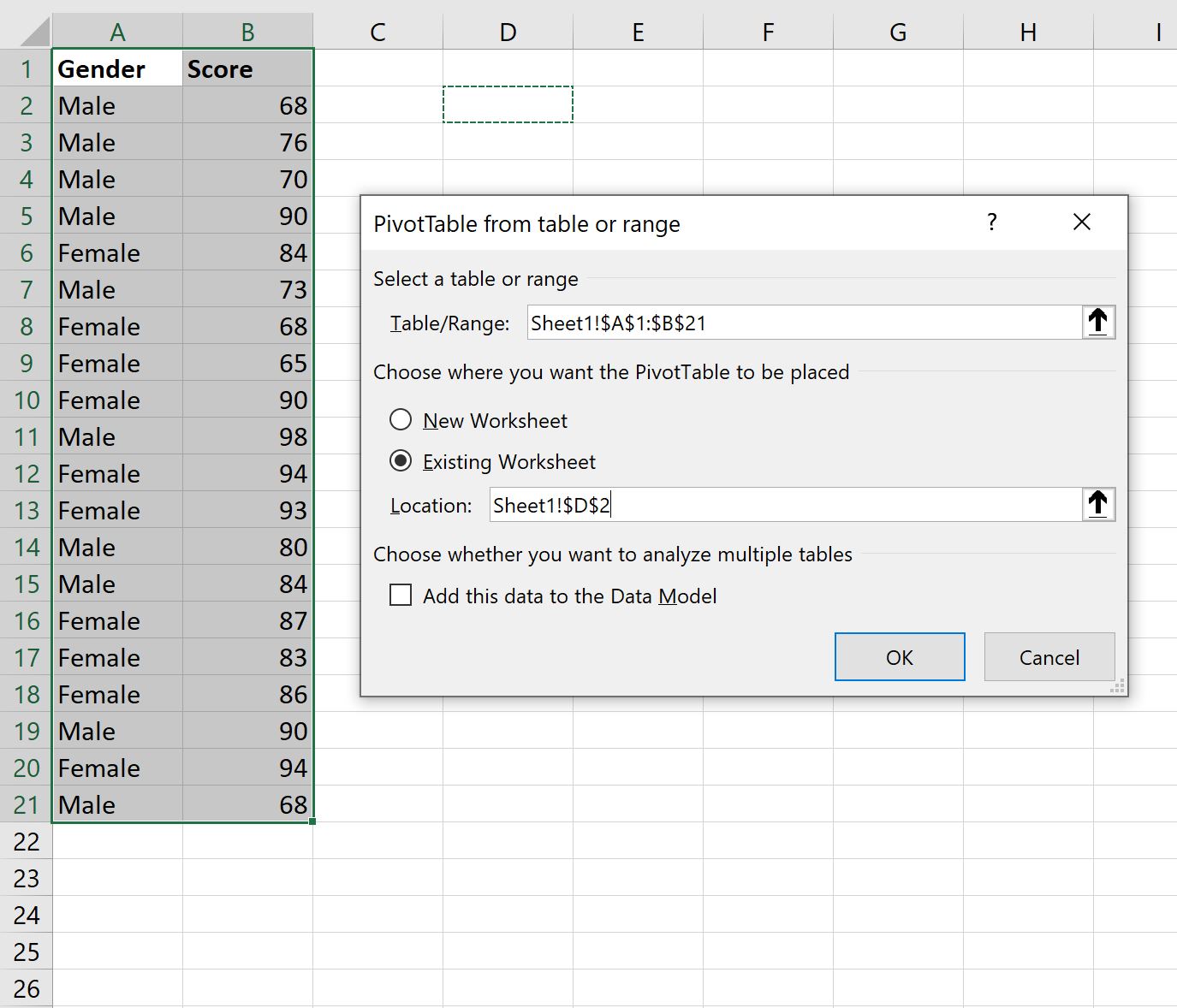
In long format, each row represents a singular, unique observation defined across standardized attribute columns. Typically, Column A contains a unique Participant Identifier, Column B contains a categorical Group Factor (e.g., “Placebo” vs. “Active”), and Column C contains the continuous numerical Measurement Value. Long format constitutes the gold standard for relational database management and modern statistical software. Within Excel, long format is the required input architecture for constructing dynamic PivotTables, allowing automated categorical aggregation and multi-series grouping.
Prior to executing any visualization workflows, researchers must conduct rigorous data hygiene. This process involves verifying that continuous measurement variables are formatted strictly as numerical data rather than text strings, removing non-numeric artifacts, resolving anomalous negative values, and deciding on an explicit treatment protocol for missing data points (such as listwise deletion or imputation) to prevent calculation errors in Excel’s aggregation engines.
3.2 Establishing Uniform Global Boundaries and Class Intervals
To construct a mathematically robust overlaid histogram, the bins applied to both datasets must be precisely identical in starting threshold, ending threshold, and interval width. Failing to establish uniform global boundaries leads to misaligned categorical columns, causing the graphical visualization to misrepresent the relationship between the two cohorts.
To establish uniform global boundaries across two data series, execute the following mathematical steps within your Excel worksheet:
- Determine the Global Minimum: Calculate the minimum value across all observations pooled from both groups using the formula:
=MIN(Range_GroupA, Range_GroupB). - Determine the Global Maximum: Calculate the maximum value across all pooled observations using the formula:
=MAX(Range_GroupA, Range_GroupB). - Establish Natural Boundaries: Round the global minimum down to the nearest convenient logical unit (e.g., rounding 12.4 down to 10.0) and the global maximum up to the nearest logical unit (e.g., rounding 87.6 up to 90.0) to establish clean, interpretable bin labels.
- Calculate Fixed Bin Width: Apply the Freedman-Diaconis or Scott rule to determine the optimal interval width, rounding to an aesthetically intuitive whole number or standard decimal interval (e.g., bin steps of 2, 5, 10, or 25 units).
- Construct the Bin Limit Array: In a dedicated reference column, populate the sequential upper boundaries of each bin from the calculated minimum threshold to the maximum threshold. This array serves as the deterministic reference table for frequency binning.
Maintaining explicit, uniform class intervals guarantees that every bar plotted on the horizontal axis corresponds to an identical physical measurement range across both cohorts, establishing geometric validity and preventing visual distortion.
4. Method 1: Generating Overlaid Histograms Using PivotTables and Grouping
4.1 Constructing the Core PivotTable Architecture
The PivotTable approach represents a powerful, semi-automated methodology for generating comparative frequency distributions from raw, long-format datasets. This method leverages Excel’s internal grouping engine to discretize continuous values without requiring manual formula construction. It is especially advantageous when managing large datasets where observations are frequently updated or appended.
To initialize the PivotTable framework, select your structured long-format data table containing the categorical Group column and continuous Measurement column. Navigate to the Insert tab on the Excel Ribbon and select PivotTable. In the dialog box, choose to place the PivotTable on a new dedicated worksheet to ensure analytical clarity.
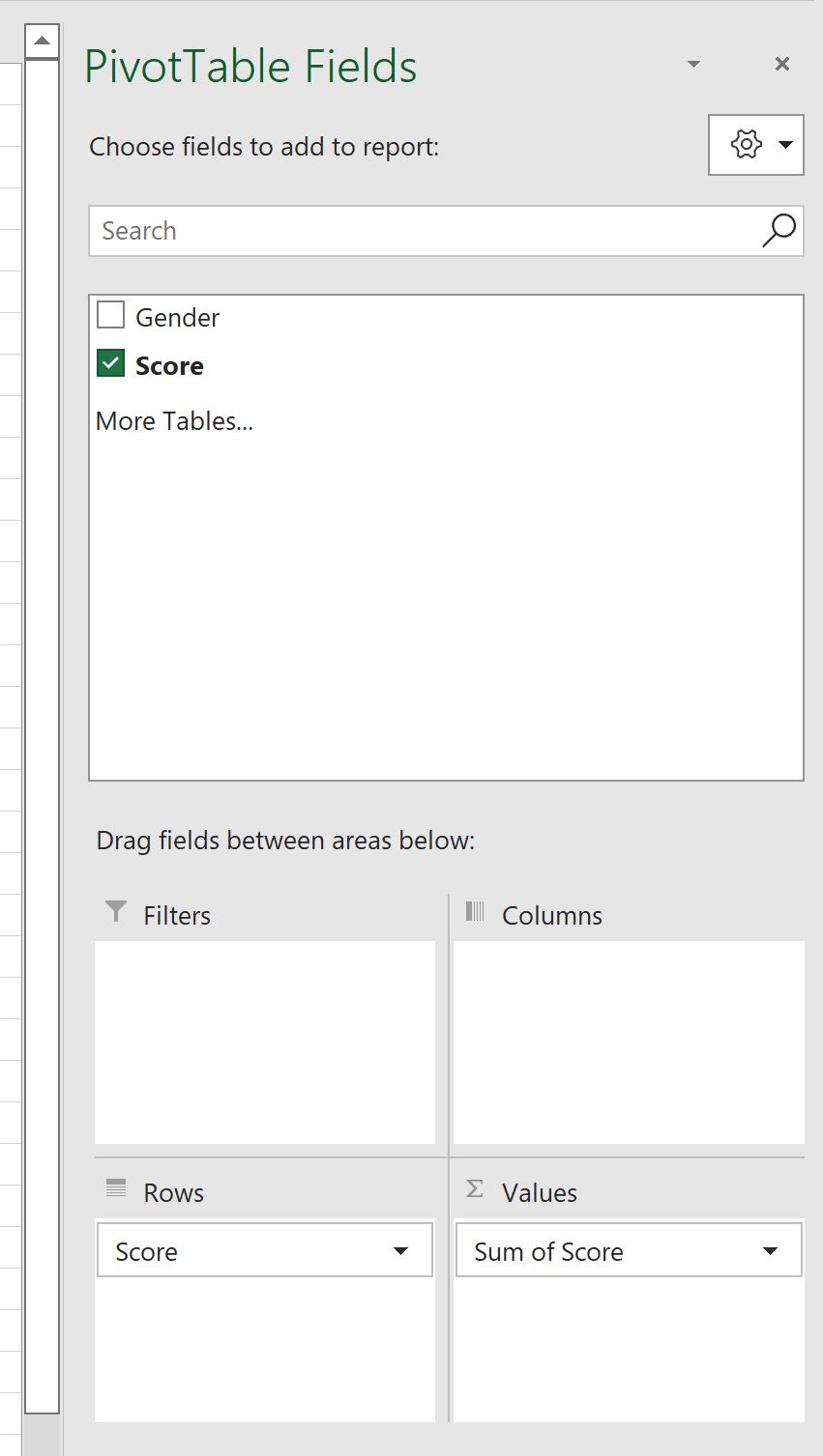
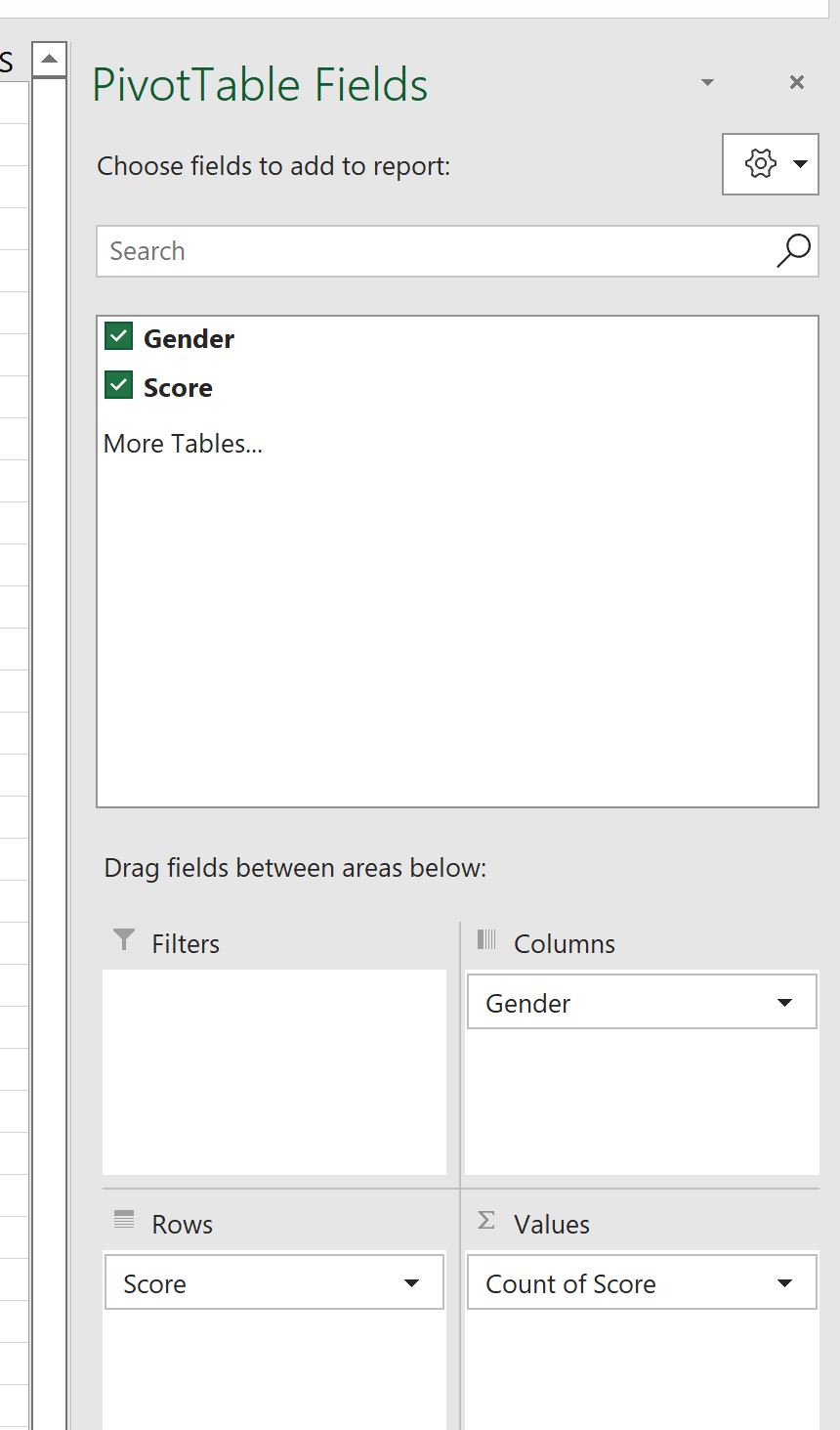
Within the PivotTable Fields task pane, configure the structural zones as follows:
- Drag the continuous Measurement Value field into the Rows area. Initially, this displays every unique numerical value observed in the dataset.
- Drag the categorical Group Indicator field into the Columns area. This creates distinct columnar partitions for each experimental condition (e.g., Control vs. Treatment).
- Drag the continuous Measurement Value field a second time, placing it into the Values area.
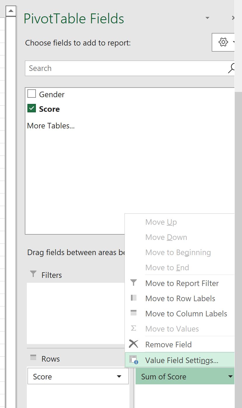
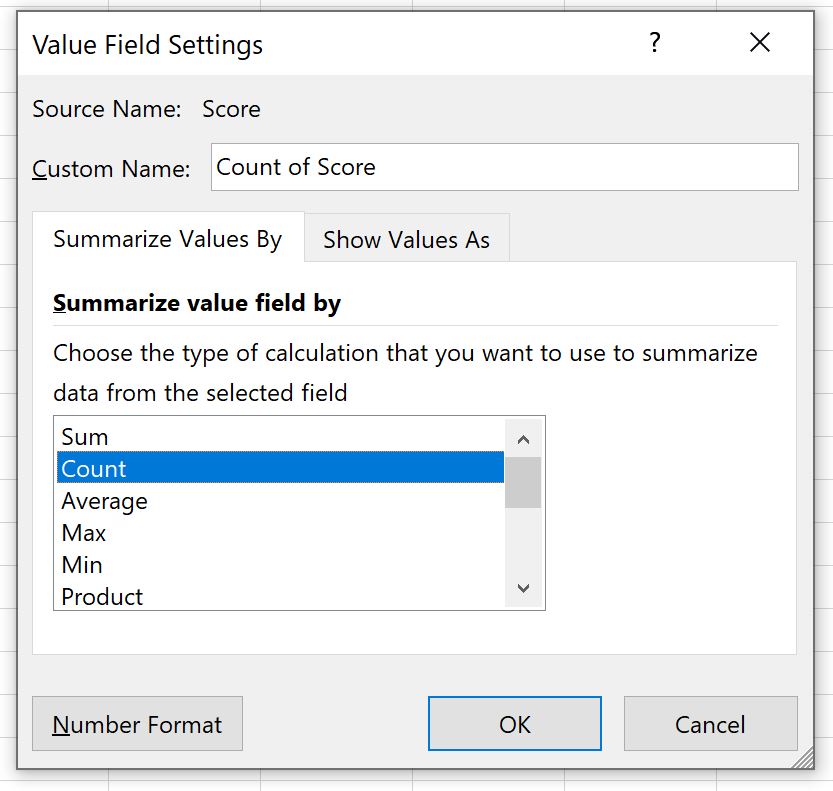
- By default, Excel may aggregate this field using the Sum function. Left-click the field in the Values area, select Value Field Settings, and change the summary calculation from Sum to Count.
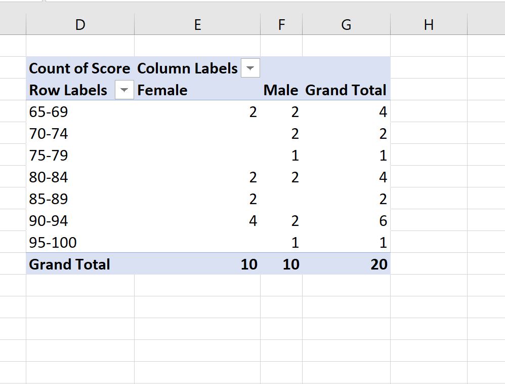
The PivotTable will now display the absolute frequency count of each unique measurement score partitioned horizontally by experimental group.
4.2 Executing Automatic and Manual Interval Grouping
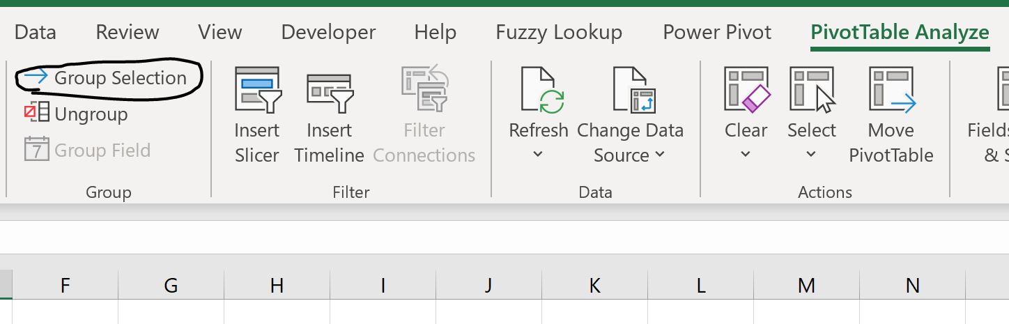
To transform the discrete, unbinned measurement values in the PivotTable into standardized histogram bins, you must utilize Excel’s native grouping utility. Right-click on any numeric cell within the Row Labels column of the PivotTable and select Group… from the contextual menu. This action summons the Grouping dialog interface.
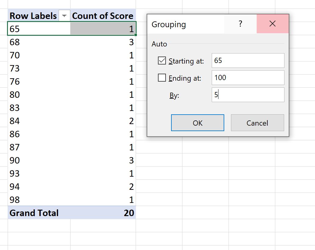
Within the Grouping dialog box, uncheck the automated check-boxes for “Starting at” and “Ending at” to disable Excel’s dynamic range defaults. Enter the uniform global boundaries calculated during your preliminary data preparation phase:
- In the Starting at input field, enter the global minimum threshold (e.g., 0 or 10).
- In the Ending at input field, enter the global maximum threshold (e.g., 100).
- In the By input field, enter your mathematically determined bin width (e.g., 10).
Click OK. Excel instantly groups the individual numeric rows into contiguous, uniform class intervals (e.g., “10-19”, “20-29”, “30-39”). Because the grouping rule applies globally across the entire PivotTable structure, both experimental groups in the column dimensions are partitioned across the exact same bin boundaries, ensuring perfect structural alignment.
4.3 Converting Pivot Data to an Overlaid Column Visualization
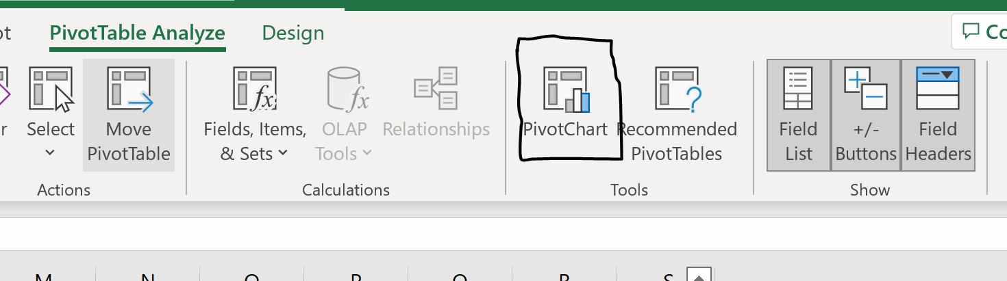
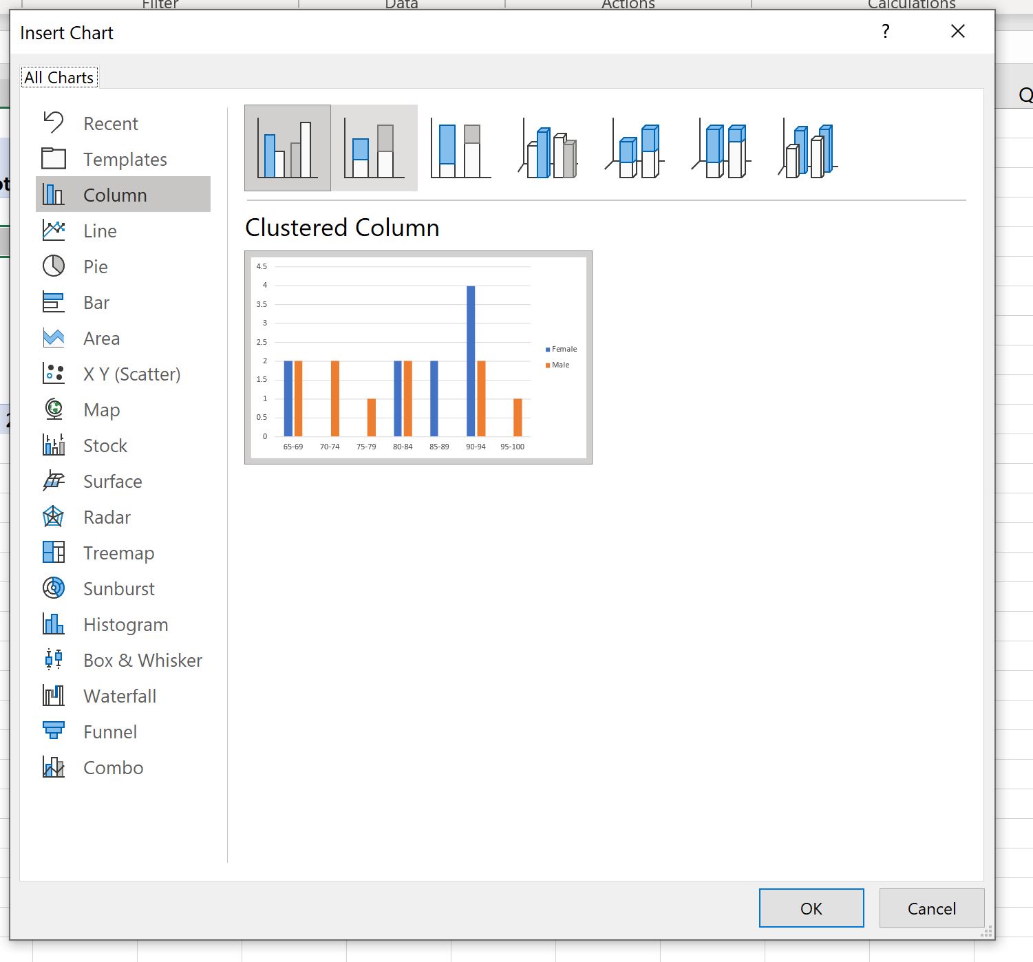
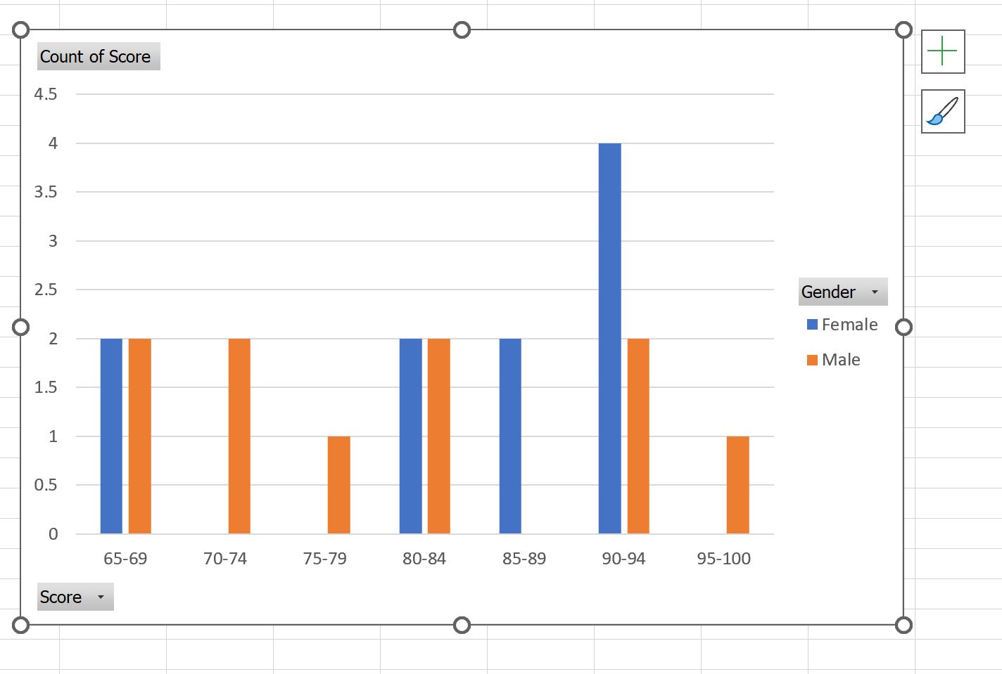
Once the grouped frequency table is established, click inside the PivotTable, navigate to the PivotTable Analyze tab, and select PivotChart. Choose the standard Clustered Column chart type and click OK. Excel inserts a chart where each bin interval displays two adjacent columns representing the respective experimental cohorts.
To convert this side-by-side clustered presentation into a true overlaid histogram, you must modify the spatial positioning of the chart series:
- Right-click on any data column in the chart and select Format Data Series… to open the formatting pane.
- Under the Series Options tab (the bar chart icon), locate the Series Overlap slider. Adjust this value from 0% to strictly 100%. Setting the overlap to 100% aligns the series directly upon the same spatial coordinate, placing one column physically over the other.
- Locate the Gap Width slider directly beneath the overlap setting. Reduce the Gap Width from the default 219% down to 0% (or a nominal 1% to 2% if subtle column separation is preferred). Setting Gap Width to zero removes whitespace between adjacent intervals, producing the classic continuous aesthetic of a statistical histogram.
At this stage, the front series will completely obstruct the rear series. Adjusting visual transparency, as detailed in Section 7, will resolve this occlusion and complete the overlay.
5. Method 2: Constructing Histograms Using the FREQUENCY Dynamic Array Function
5.1 Algorithmic Implementation of the FREQUENCY Function
The statistical FREQUENCY function represents the most rigorous, deterministic, and formulaically flexible method for constructing comparative distributions in Excel. Unlike PivotTables, which can occasionally reformat unexpectedly upon data refreshes, the FREQUENCY function generates a pure numerical data matrix that directly drives standard 2D column charts, providing complete control over normalization, percentage conversions, and axis scales.
The FREQUENCY function is a native array formula designed to calculate how often values occur within specific ranges. Its syntax is structured as follows:
=FREQUENCY(data_array, bins_array)
Where data_array represents the continuous vector of raw observation values, and bins_array represents the contiguous vertical array containing the upper boundary thresholds for each desired interval.
To implement this method, construct a clean analytical summary table on your worksheet:
- In Column E, list your sequential upper bin limits (e.g., 10, 20, 30, 40, 50, 60, 70, 80, 90, 100).
- In Column F, create descriptive text labels corresponding to each bin interval for horizontal axis formatting (e.g., “0-10”, “11-20”, “21-30”, etc.).
- In modern dynamic-array-enabled versions of Excel (Microsoft 365, Excel 2021, and Excel for the Web), navigate to cell G2 and enter the formula:
=FREQUENCY(A2:A500, E2:E11), assuming Column A contains Group 1 raw data. Press Enter. The formula automatically spills down to populate the frequency counts across all bins. - Navigate to cell H2 and enter:
=FREQUENCY(B2:B500, E2:E11), assuming Column B contains Group 2 raw data. The formula will spill down to compute the second distribution. - Note for Legacy Excel (Excel 2019 and earlier): Dynamic arrays are not enabled by default. Users must highlight the entire output range (e.g., G2:G11), type the
=FREQUENCY(...)formula, and press Ctrl + Shift + Enter simultaneously to instantiate the legacy array formula within curly brackets.
Validate your calculations by entering =SUM(G2:G11) and =SUM(H2:H11) beneath each frequency column. The sums must strictly equal the total count of observations (N) in each raw data series.
5.2 Normalizing Counts to Relative Frequencies and Percentages
When comparing experimental cohorts with disparate sample sizes (e.g., Group 1 with N = 1,200 and Group 2 with N = 450), plotting raw absolute frequency counts yields severe graphical distortion. The columns for Group 1 will tower over Group 2, creating an optical illusion of superior magnitude or dispersion even if their probability distributions are identical. To enable valid visual comparison, raw frequencies must be normalized into relative proportions or percentages.
The relative frequency (RF) of a bin is defined as:
RF = f_i / N
where f_i represents the raw frequency count of the i-th bin, and N represents the total sample size across all bins for that specific group.
To implement relative normalization in your analytical table, establish two new calculation columns:
- In Cell I2 (Group 1 Relative Frequency), enter:
=G2/SUM($G$2:$G$11)and drag or spill the formula down across all bin rows. - In Cell J2 (Group 2 Relative Frequency), enter:
=H2/SUM($H$2:$H$11)and drag or spill the formula down across all bin rows. - Format the resulting values in Columns I and J as Percentages with one or two decimal places using the Number formatting panel on the Home tab.
Normalizing both cohorts ensures that the sum of each series equals exactly 1.0 (or 100%). When plotted, both distributions share a standardized vertical scale, enabling immediate, unbiased visual evaluation of shape, central tendency, and overlap regardless of sample size disparities.
5.3 Plotting and Formatting Standard 2D Column Charts
With the normalized relative frequency table constructed, you can proceed to generate the primary chart visualization:
- Select the normalized percentage data ranges in Columns I and J simultaneously, holding the Ctrl key to select non-adjacent ranges if necessary.
- Navigate to the Insert tab on the Ribbon, locate the Charts group, and select Insert Column or Bar Chart > 2D Clustered Column.
- Right-click anywhere on the newly generated chart area and click Select Data….
- In the Select Data Source dialog box, locate the Horizontal (Category) Axis Labels section on the right-hand side and click Edit.
- Select the descriptive bin interval text labels constructed in Column F (e.g., F2:F11) and click OK. This ensures the x-axis displays accurate categorical bin boundaries rather than arbitrary sequential integers (1, 2, 3…).
- Under the Legend Entries (Series) section on the left, click Edit for Series 1 and assign the cell containing the Group 1 name. Repeat this step for Series 2. Click OK to close the dialog.
To finalize the histogram geometry, right-click on any column within the chart, choose Format Data Series…, and configure the series geometry: set Series Overlap to strictly 100% and adjust Gap Width to 0%. This produces a unified, aligned comparative histogram resting upon a shared categorical baseline.
6. Method 3: Implementing Secondary Axes and Direct Overlap Parameters
6.1 Rationale for Dual-Axis Histogram Overlays
While relative frequency normalization (Method 2) is the mathematically preferred approach for comparative distributional analysis, specific analytical and professional scenarios warrant displaying absolute raw frequencies for both groups on independent vertical axes. This occurs most frequently in industrial quality engineering, environmental monitoring, or clinical trials when absolute counts carry critical regulatory significance and must be read directly from the graph without manual percentage conversion.
A dual-axis histogram maps the primary distribution (Series 1) along the left-hand Primary Vertical Axis and maps the secondary distribution (Series 2) along the right-hand Secondary Vertical Axis. This architecture allows both distributions to span the full visual height of the plotting frame, regardless of extreme discrepancies in absolute sample size (e.g., comparing a baseline population of 10,000 subjects against a rare-condition cohort of 200 subjects).
However, analysts must approach dual-axis overlays with methodological caution. If the primary and secondary vertical axes are auto-scaled independently by Excel’s default charting engine, the visual intersection of the two histograms may introduce substantial optical distortion, falsely implying equivalencies in raw magnitude where none exist. Therefore, meticulous manual scale harmonization is mandatory when implementing this technique for peer-reviewed academic manuscripts or technical documentation.
6.2 Step-by-Step Configuration of Primary and Secondary Axes
To construct a secondary-axis comparative histogram from your raw frequency table:
- Select the raw frequency counts for both groups (e.g., Columns G and H) along with their corresponding bin category labels.
- Insert a standard 2D Clustered Column Chart via the Insert tab.
- Right-click on the specific data series corresponding to Group 2 (the series intended for the secondary axis) and select Format Data Series….
- In the Format Data Series pane, locate the Series Options tab and select the radio button labeled Secondary Axis. Excel immediately generates a secondary vertical y-axis along the right boundary of the plot area.
At this stage, Excel treats the primary and secondary series as independent visual layers. To ensure they align geometrically:
- With Series 2 selected, set Gap Width to 0%. (Note: Because Series 2 resides on the secondary axis, setting its Series Overlap is unnecessary, as its baseline is already superimposed over the primary axis).
- Select Series 1 (on the primary axis) and similarly verify that its Gap Width is set to 0%.
- Harmonize Vertical Axis Bounds: To prevent deceptive visual scaling, inspect the maximum values of both axes. If direct visual comparison of relative shape is intended, adjust the maximum bounds of both the primary and secondary axes proportionally or establish identical major unit grid increments across both vertical dimensions.
- Navigate to Chart Elements (the green plus icon beside the chart) and check Axis Titles. Ensure that you insert explicit, descriptive titles for both the Primary Vertical Axis (e.g., “Group 1 Frequency (N = 1,000)”) and the Secondary Vertical Axis (e.g., “Group 2 Frequency (N = 150)”) to prevent reader misinterpretation.
7. Visual Refinement: Transparency, Color Theory, and Boundary Styling
7.1 Transparency Formatting for Visualizing Overlapping Densities
The primary visual failure mode in overlaid column charts is occlusion: the graphical series positioned in the visual foreground completely obscures the data series positioned in the background. To resolve this issue and make both distributions simultaneously visible, you must apply alpha-channel transparency to the column fills.
To configure transparency settings in Excel:
- Left-click directly on the foreground data series within the chart to select all its constituent columns.
- Right-click the selected series and select Format Data Series….
- Navigate to the Fill & Line tab (the paint bucket icon) and expand the Fill sub-menu.
- Ensure that Solid fill is selected. Choose an appropriate base hue from the color picker.
- Locate the Transparency slider located beneath the color palette. Adjust the transparency value to a setting between 30% and 50%. A setting of 40% typically provides an optimal balance between color saturation and background visibility.
- Select the background data series, expand its Fill menu, ensure Solid fill is selected with a contrasting hue, and set its transparency to a comparable level (e.g., 30% to 40%).
When two semi-transparent fills overlap, Excel executes additive visual blending. For example, overlapping a semi-transparent blue series (foreground) with a semi-transparent yellow series (background) naturally produces a clear green intersection zone. This optical blending instantly communicates the exact region of distributional overlap to the reader.
7.2 Border and Outline Customization for Shape Distinction
While semi-transparent fills reveal overlapping areas, they can simultaneously soften the structural perimeters of histogram bars, making it difficult to pinpoint exact bin boundaries. Applying distinct, high-contrast outlines to each data series restores structural clarity and enhances graphic readability.
To apply and customize series borders:
- Select your chosen data series, open the Fill & Line tab in the Format Data Series pane, and expand the Border sub-menu.
- Select Solid line.
- Choose a border color that matches the primary series hue but at 100% opacity (0% transparency), or select a neutral dark tone (such as slate gray or black) to maximize edge definition.
- Adjust the Width parameter to between 1.0 pt and 1.5 pt. Avoid excessively thick strokes (e.g., >2.5 pt), which cause visual clutter and optical bleeding across narrow bin intervals.
- For advanced visual accessibility—particularly for greyscale printing or color-vision-deficient readers—differentiate the border stroke styles: assign a Solid line style to Series 1 and a Dash or Square Dot line style to Series 2 via the Dash type drop-down menu.
Furthermore, manage the visual layering hierarchy using Excel’s series ordering tools. If one distribution has a substantially taller mode that dominates the frame, ensure that the narrower or smaller distribution is placed in the foreground layer by opening Select Data Source and using the Move Up / Move Down arrows to reorder the series.
7.3 Academic Palette Selection and Universal Design
Modern scientific data visualization standards, including guidelines established by the American Psychological Association (APA) and major peer-reviewed journals, mandate that visual figures be universally accessible to readers with color vision deficiencies (CVD) and remain fully interpretable when reproduced in monochrome or greyscale formats.
Avoid utilizing standard red-green color combinations, which represent the most common form of color blindness (deuteranopia and protanopia). Instead, implement scientifically validated, CVD-safe color palettes, such as the Okabe and Ito palette or standard ColorBrewer divergence palettes:
- Recommended Combination 1 (High Contrast): Vermilion / Orange (RGB: 213, 94, 0) paired with Sky Blue (RGB: 86, 180, 233).
- Recommended Combination 2 (Muted Academic): Dark Navy Blue (RGB: 0, 72, 130) paired with Warm Amber (RGB: 230, 159, 0).
- Greyscale Accessibility Verification: Ensure that one series utilizes a dark tonal value (e.g., 70% black fill with solid black border) while the comparative series utilizes a light tonal value (e.g., 20% grey fill with a dashed black border).
Standardize all chart typography using clean, legible sans-serif typefaces (e.g., Arial, Calibri, or Segoe UI) with a minimum font size of 10 pt for tick labels and 12 pt for axis titles. Ensure the chart legend is placed prominently—preferably at the top-right interior or directly above the plot area—with explicit sample size annotations included directly within the group labels (e.g., “Control Cohort (n = 450)” vs. “Experimental Cohort (n = 450)”).
8. Addressing Technical Limitations of Excel’s Native Charting Engine
8.1 Inherent Constraints of the Built-in Histogram Chart Type
Understanding the architectural limitations of Microsoft Excel’s built-in statistical charting engine clarifies why manual and formula-driven workarounds remain the gold standard for comparative distribution analysis. Introduced in Excel 2016, the native “Histogram” tool was engineered as a streamlined, single-variable diagnostic plot. Consequently, its internal software architecture imposes strict constraints that prevent professional comparative analysis.
The foremost limitation is the complete absence of multi-series support within a shared coordinate system. When an analyst selects two distinct data columns and inserts a native statistical Histogram, Excel’s charting engine does not overlay the data; instead, it either generates an uninformative combined distribution that pools all observations together indiscriminately, or it generates isolated sequential sub-charts that cannot be merged.
Additionally, the native statistical histogram lacks support for secondary vertical axes, dynamic percentage transformations, and custom series overlap settings. Because the native engine calculates its own internal bin boundaries using automated algorithmic approximations, users cannot manually synchronize class intervals across multiple independent native charts. Therefore, utilizing Excel’s standard 2D Clustered Column chart framework—driven by underlying mathematical frequency matrices—remains the only viable method for generating rigorous, fully customizable overlaid histograms.
8.2 Resolving Gap Width, Alignment, and Zero-Bin Discontinuities
When mapping continuous data onto standard 2D Clustered Column charts, several technical artifacts can undermine the graphical fidelity of the visualization. The most common artifact is the zero-frequency bin discontinuity. If an empirical dataset contains empty intervals where no observations occur (e.g., zero counts in bin “40-49”), standard data filters or dynamic PivotTables may omit those empty categories entirely, collapsing the horizontal axis and distorting the spatial continuity of the physical scale.
To resolve zero-bin discontinuities:
- In PivotTables: Right-click the Row Labels area, select Field Settings…, navigate to the Layout & Print tab, and check the box labeled Show items with no data. This forces the PivotTable to retain empty class intervals, preserving a continuous, uncompressed horizontal axis.
- In Formula-Driven Tables: Ensure that your
FREQUENCYbins array contains every contiguous step along the scale, regardless of whether the output count is zero. Because theFREQUENCYfunction explicitly returns a numeric0for empty intervals, the standard column chart will render an appropriate flat baseline for that bin, accurately reflecting the absence of data.
Another common layout challenge is category alignment. By default, Excel positions column bars directly centered over categorical horizontal axis tick marks. When bin labels represent discrete ranges (e.g., “10-20”), centering the bar over the range label is visually intuitive. However, if single boundary numbers are used, analysts should clearly format the text strings (e.g., “≤ 20”, “21-30”) to prevent ambiguity regarding whether data points falling precisely on bin thresholds are binned into the lower or upper interval.
9. Statistical Interpretation of Overlapping Distributions
9.1 Visual Assessment of Normality and Parametric Assumptions
The primary analytical objective of generating an overlaid histogram is to conduct diagnostic assessments of parametric assumptions prior to running inferential statistical procedures (such as the independent samples t-test, analysis of variance [ANOVA], or linear regression modeling). Visualizing both distributions simultaneously allows researchers to evaluate whether the underlying data conforms to the classical Gauss-Markov assumptions.
Visual inspection begins with assessing normality. Analysts should examine each distribution for classical Gaussian characteristics: a single, central peak with symmetric, bell-shaped tapering tails. Specific departures to look for include:
- Positive (Right) Skewness: The distribution mode is shifted toward the lower left boundary, while an elongated tail extends toward higher positive values. Common in biological assays, reaction times, and income metrics.
- Negative (Left) Skewness: The mode is shifted toward the upper right boundary, with an elongated tail extending toward zero or negative values. Common in ceiling-limited psychometric tests.
- Bimodality / Multimodality: The presence of two or more distinct peaks indicates that the sample is not homogeneous and likely represents a mixture distribution comprising multiple underlying sub-populations.
- Heteroscedasticity (Variance Disparity): If one distribution exhibits a narrow, tall peak (leptokurtic) while the comparison group exhibits a wide, flattened shape (platykurtic), the assumption of equal variances (homoscedasticity) is violated, mandating the use of Welch’s t-test or non-parametric alternatives.
Identifying these structural characteristics graphically prevents analysts from committing Type I or Type II errors caused by running standard parametric tests on severely non-normal or heteroscedastic data distributions.
9.2 Quantifying Distributional Overlap Metrics
While visual inspection provides qualitative diagnostic insight, rigorous scientific reporting benefits from quantifying the exact geometric overlap between the two empirical distributions directly within Excel. The Overlapping Coefficient (OVL) represents the mathematical area shared by two normalized probability density distributions.
For discrete normalized histogram distributions, the Overlapping Coefficient can be calculated from your relative frequency table using the following formulation:
OVL = SUM( MIN( p_1i, p_2i ) )
where p_1i represents the relative frequency proportion of Group 1 in bin i, and p_2i represents the relative frequency proportion of Group 2 in the same bin i.
To implement this quantification directly in Excel:
- Assuming Column I contains Group 1 Relative Frequencies and Column J contains Group 2 Relative Frequencies (rows 2 to 11), navigate to Column K, row 2.
- Enter the formula:
=MIN(I2, J2)and copy or spill the formula down through row 11. Column K now contains the minimum shared proportion for every discrete class interval. - In a dedicated summary cell, calculate the total overlap:
=SUM(K2:K11). - Format this cell as a percentage. An OVL value of 100% indicates identical distributions, while an OVL value of 0% indicates completely separated, non-overlapping distributions.
Researchers can insert a small, clean callout text box directly into the Excel chart plotting area displaying the calculated summary metrics (e.g., “OVL = 64.2%”, “Group 1 Mean = 48.2 ± 8.1”, “Group 2 Mean = 56.4 ± 9.4”), pairing quantitative precision with graphical clarity.
10. Empirical Applications in Psychological and Behavioral Research
10.1 Case Study 1: Cognitive Assessment Scores Across Gender Cohorts
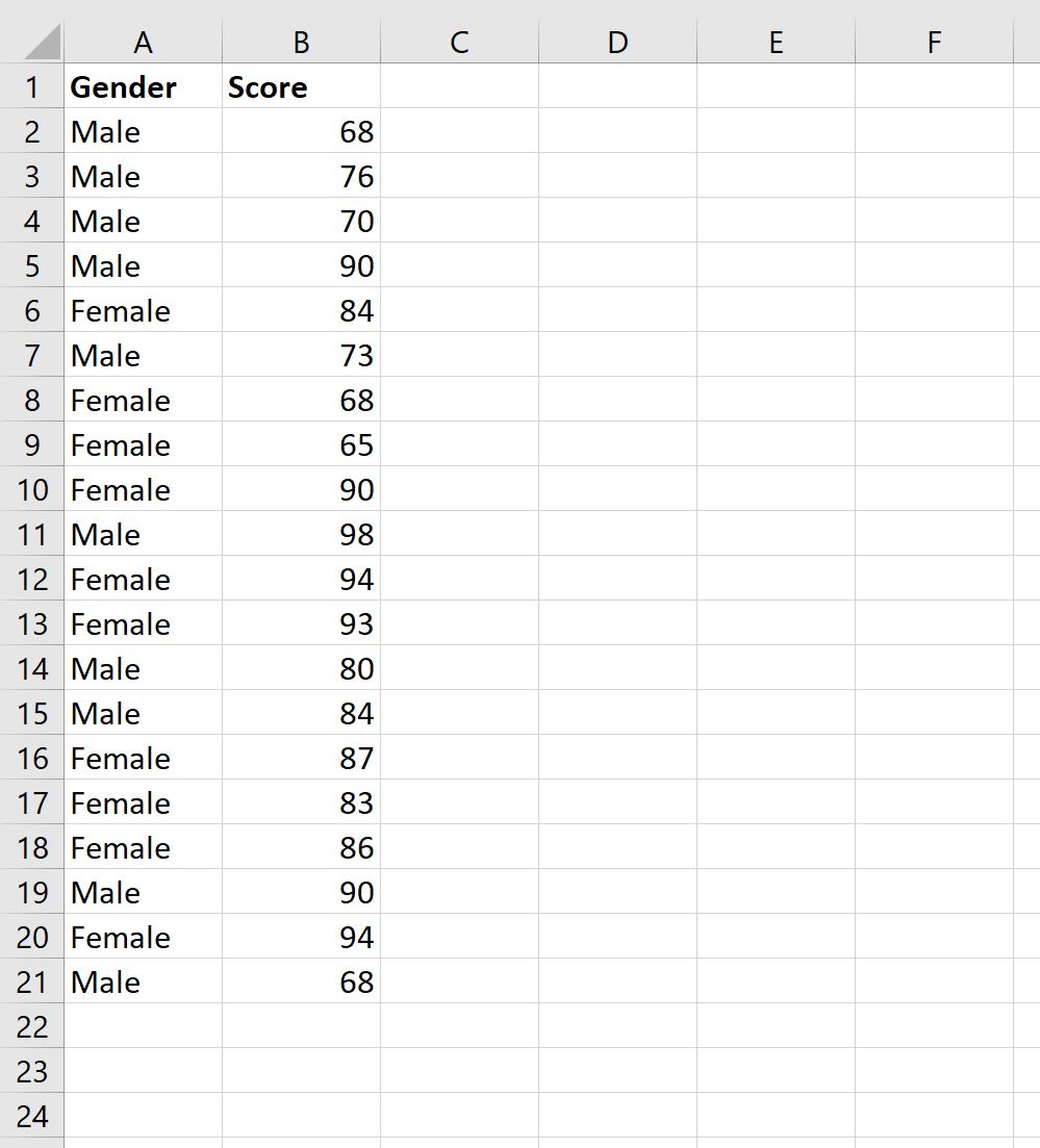
To demonstrate the end-to-end practical execution of overlaid histogram construction, consider an empirical cognitive psychology study evaluating standardized executive function scores across two demographic cohorts: Cohort A (Female, N = 250) and Cohort B (Male, N = 250). Standardized assessment scores range continuously from 50 to 150 points, with a normative population mean of 100 and a standard deviation of 15 points.
The research objective is to determine whether performance differences between the two cohorts represent a true structural shift across the entire distribution or if the groups exhibit equivalent performance profiles with minor localized variation.
The data preparation and visualization pipeline is executed as follows:
- Data Organization: Raw scores are arranged in wide format across Column A (Cohort A) and Column B (Cohort B).
- Bin Specification: Applying the Freedman-Diaconis rule yields an optimal bin width of 10 points. Bins are established with a global minimum threshold of 50 and a global maximum of 150, producing 10 uniform intervals: 50-59, 60-69, 70-79, 80-89, 90-99, 100-109, 110-119, 120-129, 130-139, and 140-150. Upper limits (59, 69, 79, …, 150) are entered into Column D.
- Frequency Generation: Dynamic array formulas are populated: Cell E2 contains
=FREQUENCY(A2:A251, D2:D11); Cell F2 contains=FREQUENCY(B2:B251, D2:D11). - Percentage Conversion: Columns G and H compute relative frequencies:
=E2/SUM($E$2:$E$11)and=F2/SUM($F$2:$F$11). - Chart Plotting: A 2D Clustered Column chart is inserted using Columns G and H. Series Overlap is adjusted to 100%, and Gap Width is adjusted to 0%.
- Styling: Cohort A is assigned a semi-transparent royal blue fill (40% transparency) with a solid blue border. Cohort B is assigned a semi-transparent amber fill (40% transparency) with a solid amber border.
The resulting visualization clearly demonstrates that both distributions share an identical bell-shaped Gaussian profile centered at approximately 100 points, with an empirical Overlapping Coefficient exceeding 91%, visually confirming the absence of meaningful cognitive disparity between the cohorts.
10.2 Case Study 2: Clinical Intervention vs. Control Group Psychological Scores
In clinical trials and psychopathology research, evaluating therapeutic efficacy requires comparing a treated clinical cohort against an untreated control or placebo group on a standardized symptom severity inventory (e.g., Beck Depression Inventory-II, scored from 0 to 63 points, where higher scores reflect greater symptom severity).
In this empirical scenario, the Control Group (N = 120) is expected to exhibit elevated symptom scores, while the Post-Intervention Clinical Group (N = 115) is hypothesized to demonstrate a leftward distributional shift toward lower symptom severity. Furthermore, clinicians must identify “non-responders”—individuals within the clinical cohort who remain in the high-severity tail region despite therapy.
The overlaid histogram is generated using normalized relative frequencies to accommodate the slight sample size discrepancy (120 vs. 115). Bin widths are set to 5-point severity tiers (0-4, 5-9, 10-14, …, 60-64). A clinical cut-off threshold marker is added by superimposing a vertical reference line at the 20-point score threshold, indicating the boundary between mild and moderate depressive symptoms.
The overlaid distribution immediately provides three vital clinical insights:
- Location Shift: The modal score of the clinical cohort shifts substantially to the left (peaking in the 5-9 interval) relative to the control group (peaking in the 25-29 interval).
- Tail Dynamics (Non-Responders): While 82% of the clinical cohort falls below the clinical cut-off threshold of 20 points, an isolated secondary mode of 12 subjects forms a heavy right-hand tail between 35 and 45 points, clearly identifying a non-responder subgroup that summary means obscured.
- Variance Alteration: The intervention group displays a significantly broader, positively skewed distribution, indicating heterogeneous treatment response profiles across subjects.
10.3 Case Study 3: Reaction Time Distributions and Behavioral Latency
Experimental cognitive psychology and human factors research frequently analyze continuous reaction time (RT) data collected across computerized behavioral paradigms. RT distributions are inherently non-normal; they follow an Ex-Gaussian distribution characterized by a normal Gaussian component combined with an exponential right-hand tail representing cognitive lapses or attentional delays.
Consider an experiment comparing reaction times (measured in milliseconds) under two conditions: Baseline Task Load (Condition 1, N = 2,500 trials) versus High Cognitive Load (Condition 2, N = 2,500 trials). Bins are structured from 200 ms to 1,200 ms in uniform 25 ms intervals.
When plotted as an overlaid histogram, the graphic illustrates that increased cognitive load does not merely shift the peak reaction time to the right; rather, it introduces a pronounced elongation of the positive exponential tail. The visual evidence clarifies that the primary effect of cognitive load is an increase in attentional lapses (the exponential tail component) rather than a uniform slowing of baseline neural processing (the Gaussian peak component). This distinction provides critical mechanistic insight that guides subsequent mathematical modeling using ex-Gaussian parameters (mu, sigma, and tau).
11. Common Technical Pitfalls and Troubleshooting in Excel
11.1 Diagnostic Guide for Common Visual and Calculation Errors
When executing complex, multi-step graphical constructions in Excel, analysts frequently encounter specific calculation errors or graphical misconfigurations. The following diagnostic reference details the underlying causes and precise remedies for common histogramming errors:
- Issue 1: Dynamic Array Spill Error (
#SPILL!):
Cause: TheFREQUENCYdynamic array formula attempts to return multiple vertical values, but one or more cells directly beneath the formula entry point already contain text, numbers, or blank space characters.
Remedy: Clear all data, formulas, and formatting from the cells immediately below the formula cell to provide an unobstructed path for the dynamic array spill range. - Issue 2: Complete Foreground Series Occlusion:
Cause: Series Overlap is set to 100%, but the foreground data series fill opacity is set to 100% (0% transparency), rendering the rear series invisible.
Remedy: Open Format Data Series > Fill, select Solid Fill, and increase the Transparency slider to between 35% and 50% for both series. - Issue 3: Erroneous Horizontal Axis Categorical Labels:
Cause: Excel treats numerical bin labels as an additional continuous data series rather than categorical text labels, plotting an extra series and replacing the horizontal axis with sequential integers (1, 2, 3…).
Remedy: Open the Select Data Source interface. Remove the bin limit series from the “Legend Entries (Series)” box on the left, click Edit under “Horizontal (Category) Axis Labels” on the right, and explicitly select your text interval range. - Issue 4: Distorted Dual-Axis Heights:
Cause: When using secondary axes, Excel’s automated scaling assigns arbitrary maximum vertical bounds (e.g., primary axis max = 50; secondary axis max = 120), distorting visual height comparisons.
Remedy: Right-click both axes, choose Format Axis…, and manually configure the Bounds > Maximum values to be strictly proportional to their respective sample sizes, or transition to Method 2 (relative percentage normalization) on a single primary axis.
11.2 Data Integrity and Reproducibility Best Practices
Maintaining analytical reproducibility and data integrity is essential in academic, clinical, and corporate environments. When building complex visualization models in Excel, adhere to these structural best practices:
First, encapsulate all raw observational data within official Excel Tables (using the shortcut Ctrl + T or navigating to Insert > Table). Excel Tables utilize structured table references (e.g., Table1[Score]) that automatically expand whenever new observation rows are appended. When a FREQUENCY formula references a structured table column, the dynamic array calculations and corresponding overlaid histograms update automatically without requiring manual cell range adjustments.
Second, implement strict formula locking using absolute cell references (e.g., $E$2:$E$11) when calculating relative frequencies and normalization factors. This prevents accidental reference shifting if formulas are dragged across worksheets or modified during collaborative peer review.
Third, validate visual distributions against external statistical environments. Before submitting technical manuscripts for publication, cross-reference your Excel-derived bin frequencies, means, and Overlapping Coefficients against dedicated statistical packages such as R (using ggplot2), Python (using seaborn/matplotlib), or IBM SPSS Statistics to verify that discretization algorithms, boundary thresholds, and visual representations are mathematically consistent.
12. Advanced Visual Extensions: Density Curves and Future Methodologies
12.1 Superimposing Theoretical Gaussian Curves Over Histograms
To further enhance the analytical rigor of an overlaid histogram, researchers can superimpose theoretical continuous Gaussian normal distribution curves directly over the empirical discrete histogram bars. This hybrid visualization—termed a combo distribution chart—allows readers to simultaneously assess empirical bin frequencies and their theoretical parametric idealizations.
To generate theoretical normal curves in Excel:
- Calculate the sample mean and sample standard deviation for each cohort using
=AVERAGE(Range)and=STDEV.S(Range). - In a dedicated reference column, populate a sequence of finely spaced continuous evaluation points (x) across the entire horizontal range (e.g., evaluating points at every 1.0 unit increment from min to max).
- Compute the continuous normal probability density for each point using the formula:
=NORM.DIST(x_value, mean, standard_dev, FALSE)
Setting the fourth argument toFALSEreturns the probability density function (PDF) value rather than the cumulative distribution function (CDF). - Scale PDF to Match Histogram Dimensions: Because the raw PDF output represents probability density per unit, you must scale it to match the visual height of your histogram bars. Multiply the PDF value by the total sample size (N) and by the histogram bin width (h):
Scaled_Density = NORM.DIST(x, mean, stdev, FALSE) * Total_N * Bin_Width
To integrate the theoretical curve into the chart, right-click the existing histogram, choose Select Data Source, add the scaled density values as a new series, and subsequently navigate to Change Chart Type > Combo. Set the empirical frequency series to Clustered Column and set the theoretical density series to Scatter with Smooth Lines (or Line Chart), producing a sophisticated hybrid analytical visualization.
12.2 Kernel Density Estimation (KDE) and Modern Alternatives
While discrete histograms represent the traditional standard for distribution visualization, they remain sensitive to bin width selection and arbitrary boundary placement. In modern computational statistics, Kernel Density Estimation (KDE) serves as the primary non-parametric alternative, generating smooth, continuous probability density curves without requiring artificial bin discretization.
A Gaussian Kernel Density Estimator calculates the continuous probability density f(x) at any given point x by summing Gaussian kernel functions centered over every individual data point in the sample:
f(x) = (1 / (n * b)) * SUM( (1 / SQRT(2 * PI())) * EXP( -0.5 * ((x – x_i) / b)^2 ) )
where x_i represents the i-th empirical observation, n is the sample size, and b represents the kernel smoothing bandwidth (optimized via Silverman’s rule of thumb).
While calculating full-scale KDE across large sample sizes is computationally intensive in standard spreadsheet formulas, analysts can approximate continuous density distributions within Excel using stepped line charts or vectorized Gaussian summation formulas. For large-scale data science applications involving multivariate distributional comparisons or high-density ridgeline plots, modern programmatic tools such as Python (Seaborn’s kdeplot) or R (ggplot2’s geom_density) provide streamlined alternatives, complementing Excel’s foundational role in quantitative analysis.
Conclusion
Constructing overlaid histograms in Microsoft Excel bridges the gap between raw quantitative data collection and intuitive exploratory data analysis. While Excel’s native statistical charting engine lacks multi-series overlay capabilities, leveraging structural workarounds—such as dynamic PivotTable interval grouping, the mathematical FREQUENCY array function, and customized 2D column formatting—provides complete control over bin boundaries, normalization, transparency, and visual hierarchy.
By enforcing uniform global bin widths via the Freedman-Diaconis rule, converting disparate sample counts into normalized relative frequencies, applying CVD-safe color palettes with 30% to 50% alpha transparency, and quantifying geometric overlap metrics such as the Overlapping Coefficient (OVL), researchers can produce publication-grade comparative visualizations that maintain strict mathematical fidelity. Mastering these spreadsheet visualization techniques equips analysts across behavioral science, clinical research, engineering, and data analytics with the capability to clearly communicate complex distributional relationships with precision and visual clarity.
References
- Freedman, D., & Diaconis, P. (1981). On the histogram as a density estimator: L2 theory. Zeitschrift für Wahrscheinlichkeitstheorie und Verwandte Gebiete, 57(4), 453–476. https://doi.org/10.1007/BF01025868
- Inman, H. F., & Bradley, E. L. (1989). The overlapping coefficient as a measure of agreement between probability distributions and point estimation of the overlap of two normal densities. Communications in Statistics – Theory and Methods, 18(10), 3851–3874. https://doi.org/10.1080/03610928908830127
- Microsoft Corporation. (2024). FREQUENCY function in Microsoft Excel. Microsoft Support. https://support.microsoft.com/en-us/office/frequency-function-44e3be2b-de50-4952-bf51-da4902777b29
- Okabe, M., & Ito, K. (2008). Color Universal Design (CUD): How to make figures and presentations that are friendly to colorblind people. J*FLY Data Repository for Drosophila Researchers. https://jfly.uni-koeln.de/color/
- Pearson, K. (1895). Contributions to the mathematical theory of evolution.—II. Skew variation in homogeneous material. Philosophical Transactions of the Royal Society of London. A, 186, 343–414. https://doi.org/10.1098/rsta.1895.0010
- Scott, D. W. (1979). On optimal and data-based histograms. Biometrika, 66(3), 605–610. https://doi.org/10.1093/biomet/66.3.605
- Silverman, B. W. (1986). Density estimation for statistics and data analysis. Chapman & Hall/CRC. https://doi.org/10.1201/9781315140919
- Sturges, H. A. (1926). The choice of a class interval. Journal of the American Statistical Association, 21(153), 65–66. https://doi.org/10.1080/01621459.1926.10502161
- Tukey, J. W. (1977). Exploratory data analysis. Addison-Wesley Publishing Company.
- Wong, B. (2011). Points of view: Color blindness. Nature Methods, 8(6), 441. https://doi.org/10.1038/nmeth.1618
